Lecture 1. Descriptive statisics. Distributions. Sampling
Petr V. Nazarov, LIH
2024-02-05
| Materials: Presentation Tasks |
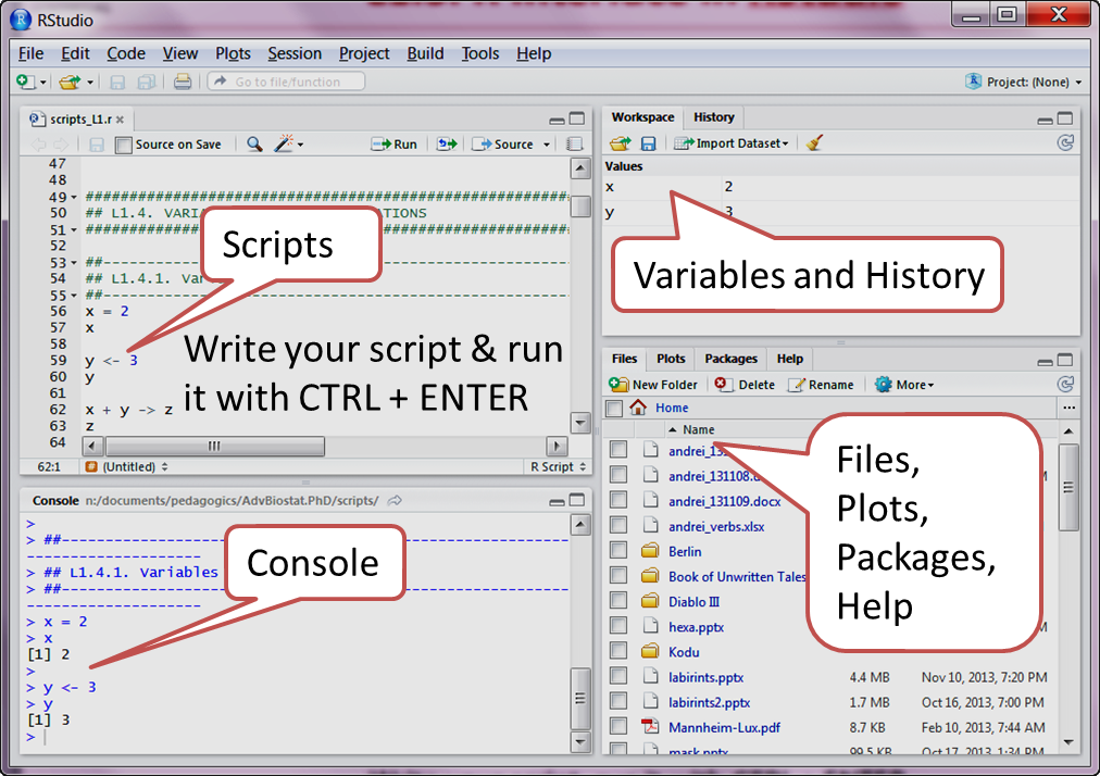
Please run RStudio. The window is devided into 4 sections” scripts, console, variables and other (files, plots, packages, help).
1.1. NUMERICAL MEASURES
Let’s start importing Mice (790 mice from different strains) data and
checking its structure. Data from http://phenome.jax.org Survey of calcium & sodium
intake and metabolism with bone and body composition data
Project symbol: Tordoff3, accession number: MPD:103
Mice = read.table("http://edu.modas.lu/data/txt/mice.txt", sep="\t", header=TRUE, stringsAsFactors = TRUE)
str(Mice)
## 'data.frame': 790 obs. of 14 variables:
## $ ID : int 1 2 3 368 369 370 371 372 4 5 ...
## $ Strain : Factor w/ 40 levels "129S1/SvImJ",..: 1 1 1 1 1 1 1 1 1 1 ...
## $ Sex : Factor w/ 2 levels "f","m": 1 1 1 1 1 1 1 1 1 1 ...
## $ Starting.age : int 66 66 66 72 72 72 72 72 66 66 ...
## $ Ending.age : int 116 116 108 114 115 116 119 122 109 112 ...
## $ Starting.weight : num 19.3 19.1 17.9 18.3 20.2 18.8 19.4 18.3 17.2 19.7 ...
## $ Ending.weight : num 20.5 20.8 19.8 21 21.9 22.1 21.3 20.1 18.9 21.3 ...
## $ Weight.change : num 1.06 1.09 1.11 1.15 1.08 ...
## $ Bleeding.time : int 64 78 90 65 55 NA 49 73 41 129 ...
## $ Ionized.Ca.in.blood : num 1.2 1.15 1.16 1.26 1.23 1.21 1.24 1.17 1.25 1.14 ...
## $ Blood.pH : num 7.24 7.27 7.26 7.22 7.3 7.28 7.24 7.19 7.29 7.22 ...
## $ Bone.mineral.density: num 0.0605 0.0553 0.0546 0.0599 0.0623 0.0626 0.0632 0.0592 0.0513 0.0501 ...
## $ Lean.tissues.weight : num 14.5 13.9 13.8 15.4 15.6 16.4 16.6 16 14 16.3 ...
## $ Fat.weight : num 4.4 4.4 2.9 4.2 4.3 4.3 5.4 4.1 3.2 5.2 ...Measures of location
Let’s check some measures of location for Bleeding.time
column. As data contain NA we use na.rm=TRUE
parameter to exclude NA values.
x = Mice$Bleeding.time
# mean
mean(x, na.rm=TRUE)
## [1] 60.99868# median
median(x , na.rm=TRUE)## [1] 55# now, we need a package `modeest`
## run commented line below only once
#install.packages("modeest")
library(modeest)## Warning: package 'modeest' was built under R version 4.3.2mlv(x, na.rm=TRUE)## [1] 50Nonparametric measures are quartiles, quantiles, percentiles. Let’s apply to a simple data vector (not Mice data):
## define your data
x = c(12, 16, 19, 22, 23, 23, 24, 32, 36, 42, 63, 68)
## overview min, Q1, Q2, Q3, max
quantile(x)
## 0% 25% 50% 75% 100%
## 12.00 21.25 23.50 37.50 68.00## calculate 1st quartile
quantile(x, 0.25)## 25%
## 21.25Measures of variability
Now, consider measures of variability: variance, standard deviation, IQR, CV, MAD
## variance
var(x)
## [1] 320.2424## standard deviation
sd(x)## [1] 17.89532## interquartile range (nonparametric)
IQR(x)## [1] 16.25## CV
sd(x)/mean(x)## [1] 0.5651153## MAD
IQR(x)## [1] 16.25Parametric vs nonparametric
What is the reason to use nonparametric measures if their power is
lower? Let’s generate 2 data vectors: x1 - original, x2 - with an
outlier (digits swapped 18->81) (please note that in R
mad is scaled to give similar value as sd)
Parametric:
x1 = c(23,12,22,12,21,18,22,20,12,19,14,13,17)
x2 = c(23,12,22,12,21,81,22,20,12,19,14,13,17)

## Parametric measures
c(mean(x1), mean(x2))
## [1] 17.30769 22.15385c(var(x1), var(x2))## [1] 17.89744 330.47436c(sd(x1), sd(x2))## [1] 4.230536 18.178954Nonparametric:
# Non-parametric measures
c(median(x1), median(x2))
## [1] 18 19c(mad(x1), mad(x2))## [1] 5.9304 5.9304c(IQR(x1), IQR(x2))## [1] 8 9Skewness
Skewness is the measure of the shape of a data distribution. Data skewed to the left result in negative skewness; a symmetric data distribution results in zero skewness; and data skewed to the right result in positive skewness.
## we need package `e1071` - please install (install.packages function)
library(e1071)
##
## Attaching package: 'e1071'## The following object is masked from 'package:modeest':
##
## skewness## skewness
skewness(Mice$Starting.weight)## [1] 0.2114894skewness(Mice$Bleeding.time,na.rm=TRUE)## [1] 5.458278Measures of association
Covariance: A measure of linear association between two variables. Positive values indicate a positive relationship; negative values indicate a negative relationship.
## let's use variables (less typing)
x = Mice$Starting.weight
y = Mice$Ending.weight
## plot
plot(x, y, pch=19, col=4)
## covariance
cov(x,y)
## [1] 39.84946Correlation (Pearson product moment correlation coefficient) is the measure of linear association between two variables that takes on values between -1 and +1. Values near +1 indicate a strong positive linear relationship, values near -1 indicate a strong negative linear relationship; and values near zero indicate the lack of a linear relationship.
Spearman Correlation is the nonparametric stable measure of association, equal to Pearson correlation between ranks
## correlation (Pearson)
cor(x, y)
## [1] 0.9422581## correlation (Spearman)
cor(x, y, method="spearman")## [1] 0.94236661.2 EXPLORATORY DATA ANALYSIS
Frequency distributions
Frequency distribution - A tabular summary of data showing the number (frequency) of items in each of several nonoverlapping classes.
Relative frequency distribution - A tabular summary of data showing the fraction or proportion of data items in each of several nonoverlapping classes. Sum of all values should give 1
Let’s load pancreatitis data. The role of smoking in the
etiology of pancreatitis has been recognized for many years. To provide
estimates of the quantitative significance of these factors, a
hospital-based study was carried out in eastern Massachusetts and Rhode
Island between 1975 and 1979. 53 patients who had a hospital discharge
diagnosis of pancreatitis were included in this unmatched case-control
study. The control group consisted of 217 patients admitted for diseases
other than those of the pancreas and biliary tract. Risk factor
information was obtained from a standardized interview with each
subject, conducted by a trained interviewer.
Panc = read.table( "http://edu.modas.lu/data/txt/pancreatitis.txt", sep="\t", header=TRUE, as.is = FALSE)
str(Panc)
## 'data.frame': 270 obs. of 3 variables:
## $ PatientID: Factor w/ 267 levels "pid0024","pid0145",..: 1 2 3 4 5 6 7 8 9 10 ...
## $ Smoking : Factor w/ 3 levels "Ex-smoker","Never",..: 1 3 3 2 3 1 1 3 3 3 ...
## $ Disease : Factor w/ 2 levels "other","pancreatitis": 1 1 2 1 1 1 2 1 1 1 ...Now, we build crosstabulation to see frequency distribution and then relative frequency distribution
# frequency distribution (crosstabulation)
FD = table(Panc[,-1])
FD
## Disease
## Smoking other pancreatitis
## Ex-smoker 80 13
## Never 56 2
## Smoker 81 38# relative frequency distribution
RFD = prop.table(table(Panc[,-1]),2) # 2 – sum by columns
RFD## Disease
## Smoking other pancreatitis
## Ex-smoker 0.36866359 0.24528302
## Never 0.25806452 0.03773585
## Smoker 0.37327189 0.71698113Now let’s visualize the results using barplot and
pie
# barplot with some beauty
barplot( t(RFD)*100,
         beside=TRUE,
         col=c(4,2),
         main="Smoking Effect on Pancreatitis",
         xlab="Smoking status",
         ylab="Percentage")
legend("top",colnames(RFD),col=c(4,2),pch=15)
# pie
par(mfcol=c(1,2)) # define 1x2 windows
pie(RFD[,1], main = colnames(RFD)[1])
pie(RFD[,2], main = colnames(RFD)[2])
Histogram and probability density function
Here we see how to visualize empirical probability distribution for numeric (continues) measures.
# histogram (breaks can be omited - optional)
hist(Mice$Starting.weight, breaks = seq(8,40),col=4)
# Probability density function (convolution with a smooth kernel)
plot(density(Mice$Starting.weight), lwd=2, col=4)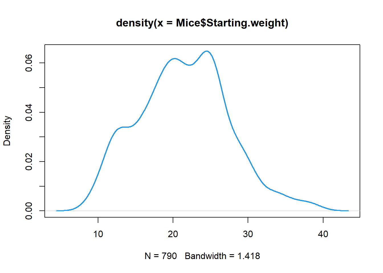
- if your data contain NA, use
na.rm=TRUEparameter in thedensity() - you can play with kernel width (smoothing) by adding
widthparameter - use
cut=0parameter to ensure value limits (avoid smoothed line with more extreme values than min and max in the data)
Box plot
Boxplot is a simple ‘ancient’ way to visualize data - needs only a pencil to draw. It is based on five-number summary: min, Q1, Q2(median), Q3, max. The box contains 50% of data points. Whiskers extend to 1.5*IQR (or min/max data point)
## define colors for strains
col_strain = rainbow(nlevels(Mice$Strain))

## build boxplots (with some makeup ;)
boxplot(Ending.weight ~ Strain,
        data = Mice,
        las = 2,
        col = col_strain,
        cex.axis = 0.7,
        ylab="Weight, g",
        main="Mouse weight ~ Strains")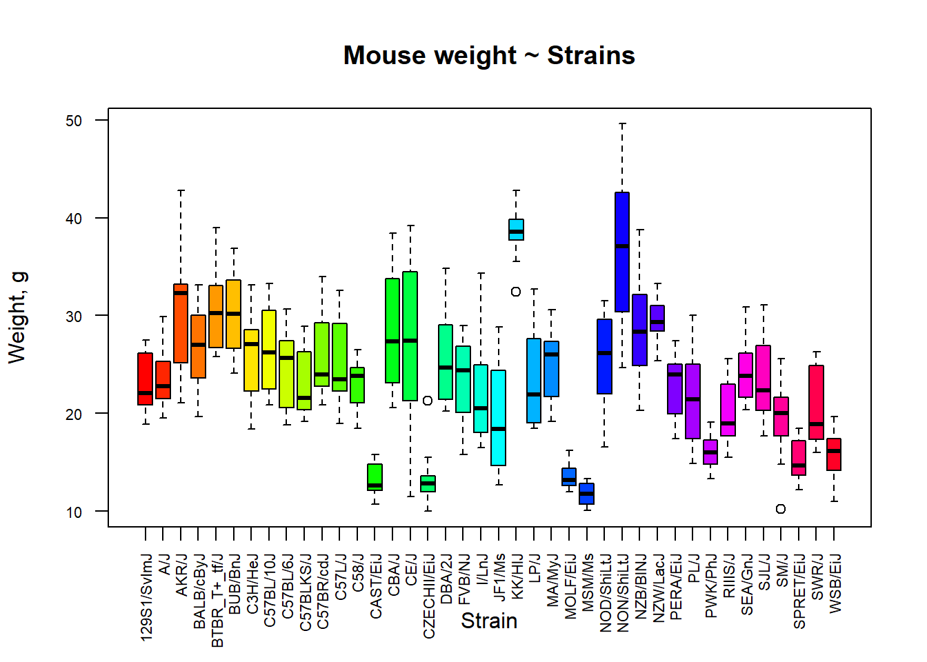
Violin plot
There are better options than box plots in R. Consider using
violin plots! I do not use ggplot2 for
simplicity sake, but here it is needed:
library(ggplot2)

p = ggplot(Mice, aes(x=Strain, y=Ending.weight, fill=Strain)) +
  geom_violin(scale="width") + geom_boxplot(width=0.3)
p = p + theme_grey(base_size = 10)
p = p + theme(axis.text.x = element_text(angle = 90, vjust = 0.5, hjust = 1))
p = p + theme(legend.key.size = unit(0.3, 'cm'))
print(p)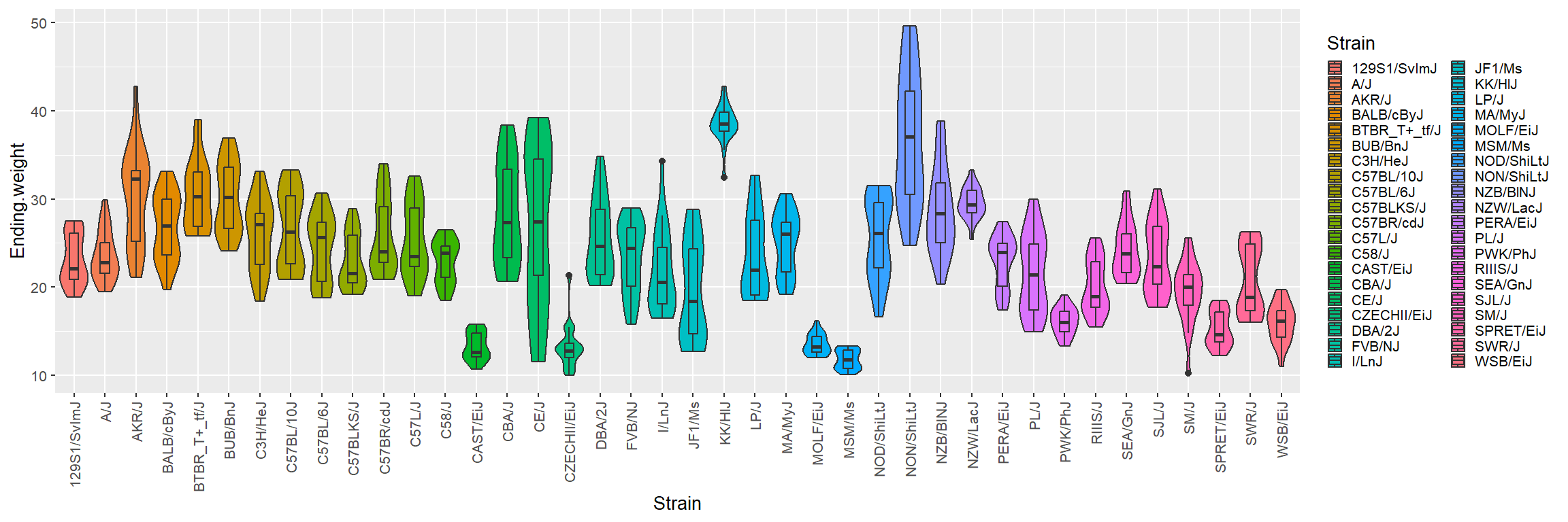
1.3 DETECTION OF OUTLIERS
z-score
z-score: this value is computed by dividing the
deviation from the mean m by the standard deviation s.
A z-score is referred to as a standardized value and
denotes the number of standard deviations xi is from the mean.
In R use scale(x) function to get z-scores for x
vector.
Let’s try to identify outlier mice on the basis of Weight change variable
x = Mice$Weight.change

# z-score
z = scale(x)

# show outlier values
x[abs(z)>3]
## [1] 0.658 0.000 0.725 0.565 0.578 0.679 0.642 2.109 0.748 0.669# show outlier mice
Mice[abs(z)>3,]## ID Strain Sex Starting.age Ending.age Starting.weight Ending.weight
## 40 100 AKR/J f 66 112 37.4 24.6
## 262 169 CAST/EiJ f 64 NA 12.5 12.5
## 263 170 CAST/EiJ f 64 110 16.0 11.6
## 302 930 CE/J f 68 112 24.6 13.9
## 303 931 CE/J f 68 112 23.7 13.7
## 306 990 CE/J f 65 120 26.8 18.2
## 307 991 CE/J f 65 113 17.9 11.5
## 318 613 CZECHII/EiJ f 69 113 10.1 21.3
## 343 69 DBA/2J f 66 108 28.6 21.4
## 622 156 PL/J f 66 116 24.2 16.2
## Weight.change Bleeding.time Ionized.Ca.in.blood Blood.pH
## 40 0.658 52 1.17 7.29
## 262 0.000 NA NA NA
## 263 0.725 51 1.24 7.26
## 302 0.565 81 1.31 7.24
## 303 0.578 55 1.31 7.23
## 306 0.679 59 1.30 7.23
## 307 0.642 91 1.32 7.18
## 318 2.109 57 1.17 7.05
## 343 0.748 48 1.22 7.13
## 622 0.669 51 1.16 7.27
## Bone.mineral.density Lean.tissues.weight Fat.weight
## 40 0.0589 18.1 5.5
## 262 NA NA NA
## 263 0.0506 9.2 2.1
## 302 0.0500 7.9 2.1
## 303 0.0506 9.1 2.5
## 306 0.0535 11.6 3.2
## 307 0.0443 8.2 2.6
## 318 0.0419 8.0 1.8
## 343 0.0474 16.7 3.9
## 622 0.0499 13.4 4.1## plot using red (code:2) color for outliers
plot(x, pch=19, col= c(4,2)[as.integer(abs(z)>3)+1] )
Iglewicz-Hoaglin nonparametric
Same with nonparametric method (coef. 0.6745 is already in
mad function):
z = (x-median(x))/mad(x)
# index of outlier mice
iout = abs(z)>3.5

## plot using red (code:2) color for outliers
plot(x, pch=19, col= c(4,2)[as.integer(iout)+1] )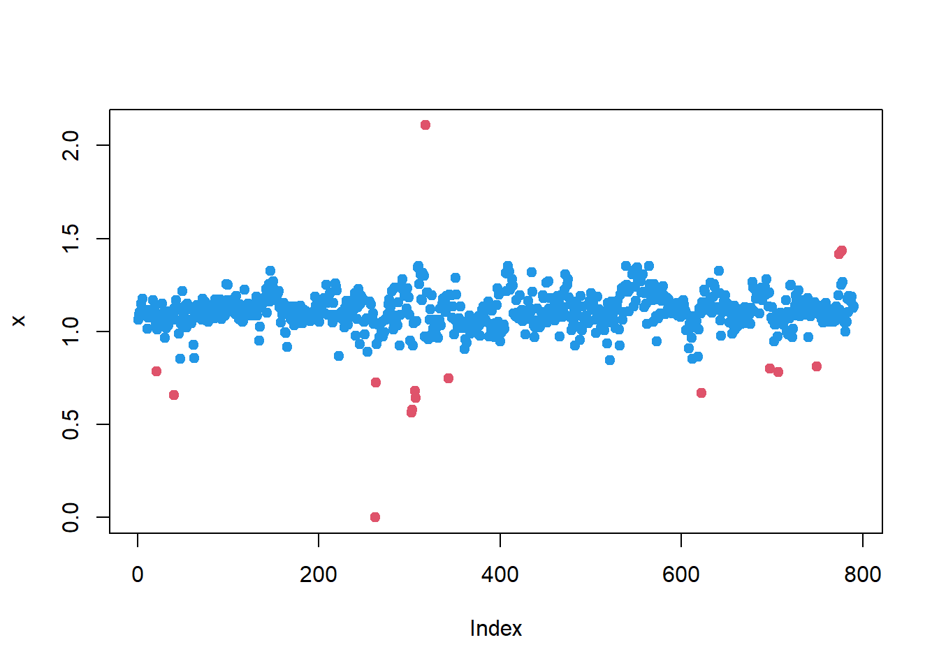
Grubb’s method
library(outliers)
x1 = x
while(grubbs.test(x1)$p.value<0.05)
  x1[ x1==outlier(x1) ] = NA

plot(x, pch=19, col=2, main="Grubbs' method")
points(x1, pch=19, col=4)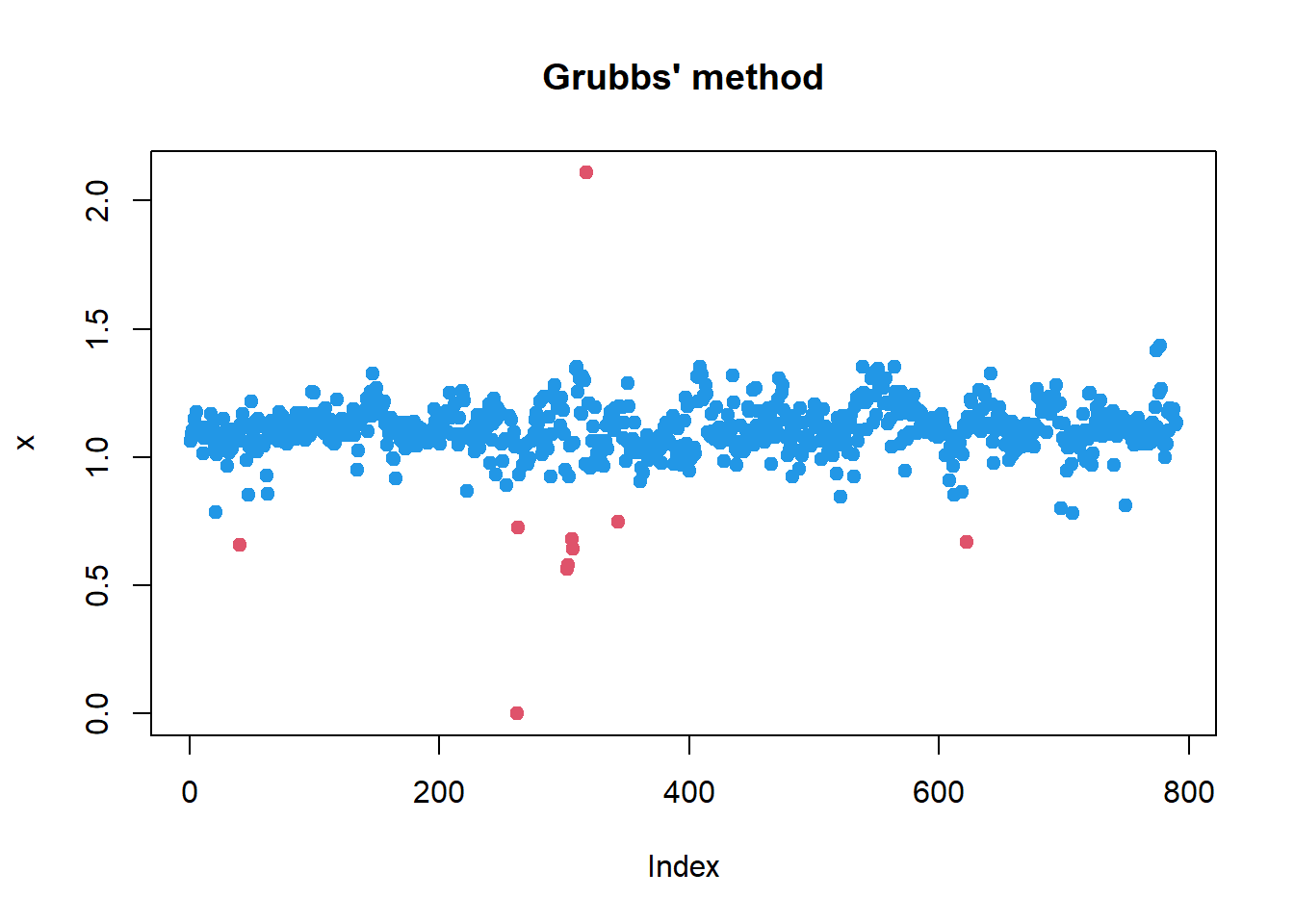
1.4 DISTRIBUTIONS
Probability density function - is a function used to compute probabilities for a continuous random variable. The area under the graph of a probability density function over an interval represents probability (so, total area = 1). Values on y-axis has no meaning (depends on x units)
Normal distribution
Normal (Gaussian) probability distribution is the most used continuous probability distribution. Its probability density function is bell shaped and determined by its mean \(\mu\) and standard deviation \(\sigma\).

| probability density (x->y): |
dnorm(x, ...)
|
| cumulative probability (x->p): |
pnorm(x, ...)
|
| quantile (p->x): |
qnorm(p, ...)
|
| generate n random variables (x): |
rnorm(n, ...)
|
Task: Suppose that the score on an aptitude test are normally distributed with a mean of 100 and a standard deviation of 10. (Some original IQ tests were purported to have these parameters.) (a) What is the probability that a randomly selected score is below 90?
- What is the probability that a randomly selected score is above 125?
- Find the score cutting top 5% respondent
Here we just need to calculate areas under P.D.F.
## (a) probability that a randomly selected score is below 90
pnorm(90,100,10)
## [1] 0.1586553## (b) probability that a randomly selected score is above 125
1-pnorm(125,100,10)## [1] 0.006209665## (c) find the score cutting top 5% respondent
qnorm(1-0.05,100,10)## [1] 116.4485t distribution
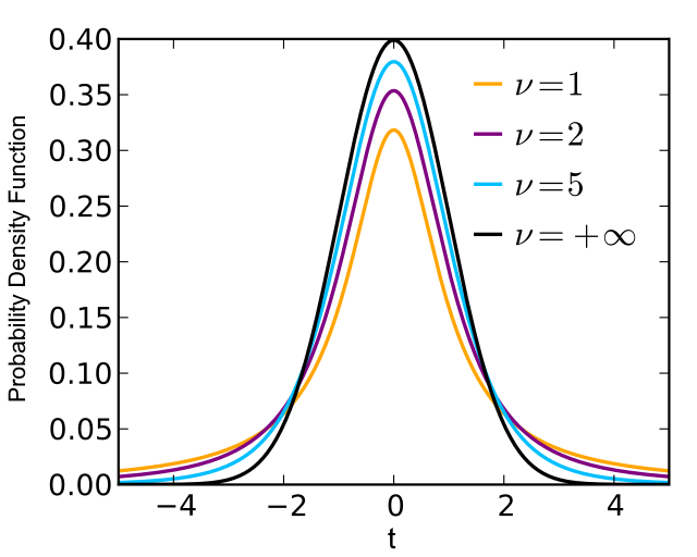
| probability density (x->y): |
dt(x, ...)
|
| cumulative probability (x->p): |
pt(x, ...)
|
| quantile (p->x): |
qt(p, ...)
|
| generate n random variables (x): |
rt(n, ...)
|
Chi2 distribution
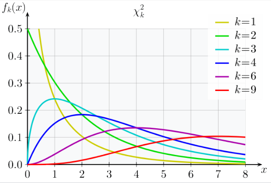
| probability density (x->y): |
dchisq(x, ...)
|
| cumulative probability (x->p): |
pchisq(x, ...)
|
| quantile (p->x): |
qchisq(p, ...)
|
| generate n random variables (x): |
rchisq(n, ...)
|
F distribution
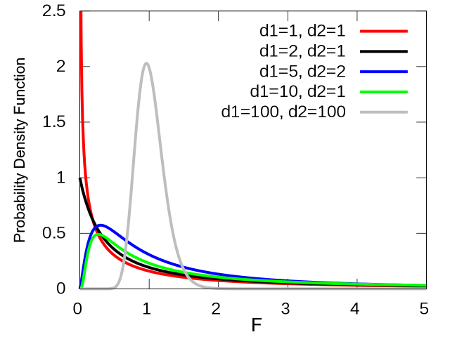
| probability density (x->y): |
df(x, ...)
|
| cumulative probability (x->p): |
pf(x, ...)
|
| quantile (p->x): |
qf(p, ...)
|
| generate n random variables (x): |
rf(n, ...)
|
1.5 SAMPLING DISTRIBUTION
Population parameter: A numerical value used as a summary measure for a population of size N (e.g., the population mean \(\sigma\), variance \(\sigma^2\), standard deviation \(\sigma\))
Sample statistic: A numerical value used as a summary measure for a sample of size \(n\) (e.g., the sample mean \(m\), the sample variance \(s^2\), and the sample standard deviation \(s\))
Assume that these mice is a population with size N=790. Let’s build 5 samples with n=20
m = double(0)
s = double(0)
p = double(0)

for (i in 1:5){
  ix = sample(1:nrow(Mice),20)
  m[i] = mean(Mice$Ending.weight[ix])
  s[i] = sd(Mice$Ending.weight[ix])
  p[i] = mean(Mice$Sex[ix] == "m")
}

summary(m)
## Min. 1st Qu. Median Mean 3rd Qu. Max.
## 21.94 22.71 24.23 24.61 26.62 27.55summary(s)## Min. 1st Qu. Median Mean 3rd Qu. Max.
## 4.794 6.824 7.838 7.576 8.470 9.956summary(p)## Min. 1st Qu. Median Mean 3rd Qu. Max.
## 0.45 0.55 0.60 0.57 0.60 0.65Thanks for following! See more on the topic in the lecture!
| Home Next |
By Petr Nazarov
|