2. Distributions and Correlations
Petr V. Nazarov, LIH
2024-10-14
After the previous section 1, you should have loaded the following data:
Mice- mouse phenome dataset (790 mice)miR&mRNA- microRNA and mRNA profiles of A375 cell line after stimulation with IFNg [Nazarov et al, Nucleic Acid Research, 2013]Prot- protein-level results of MS/MS proteomics (from MaxQuant analysis) [Schuster et al, Nature Communication, ~2021]mtcars&iris- standard R datasets (preloaded, no need to load)
If not, please load:
## load the script from Internet
source("http://r.modas.lu/readAMD.r")
source("http://r.modas.lu/readMaxQuant.r")

## Mouse 'phenome' data
Mice = read.table("http://edu.modas.lu/data/txt/mice.txt",
                  sep="\t",
                  header=TRUE,
                  stringsAsFactors = TRUE)

## miRNA data
miR = readAMD("http://edu.modas.lu/data/txt/mirna_ifng.amd.txt",stringsAsFactors = TRUE)

## mRNA data
mRNA = readAMD("http://edu.modas.lu/data/txt/mrna_ifng.amd.txt",
               stringsAsFactors = TRUE,
               index.column="GeneSymbol",
               sum.func="mean")

## Protein groups
Prot = readMaxQuant("http://edu.modas.lu/data/txt/proteingroups.txt")
2.1. Boxplot
Let’s use to check behavior of log-intensity in miRNA dataset. Each box includes 50% of data points (between 1st and 3rd quartiles). Median is shown by a thick line.
boxplot()- command to draw a boxplot
Try this:
boxplot(miR$X)Hmm… not too nice! Let’s improve
col- color of the barslas- axis text direction (2 for perpendicular)cex.names,cex.axis- size of the names on the categorical axis and numerical axismain- title of the figure. Alternativelytitle()can be called to add names after.xlab,ylab- names of axes
## define color
col_mir = rainbow(10)[as.integer(miR$meta$time)]
## better boxplot
boxplot(miR$X,
        las=2,
        col=col_mir,
        ylab="log intensity",
        main="Intensities in the samples")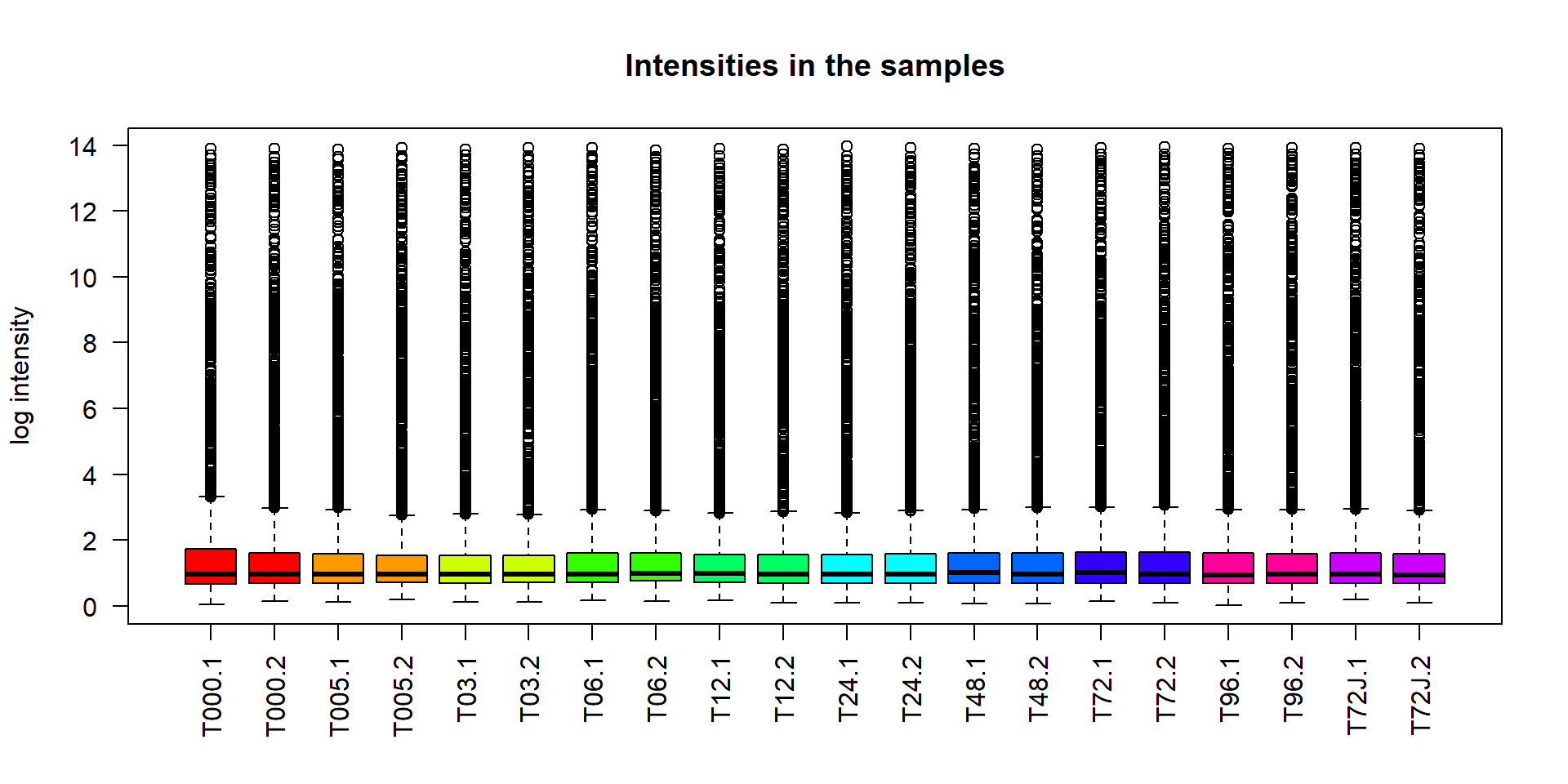
Boxplot can be used also to summarize data over a factor using
dependency operator ~. Let’s investigate weight of mice in
different strains.
## define colors - individual for each strain
col_strain = rainbow(nlevels(Mice$Strain))

## build boxplots
boxplot(Ending.weight ~ Strain,
        data = Mice,
        las = 2,
        col = col_strain,
        cex.axis = 0.7,
        ylab="Weight, g",
        main="Mouse weight in Strains")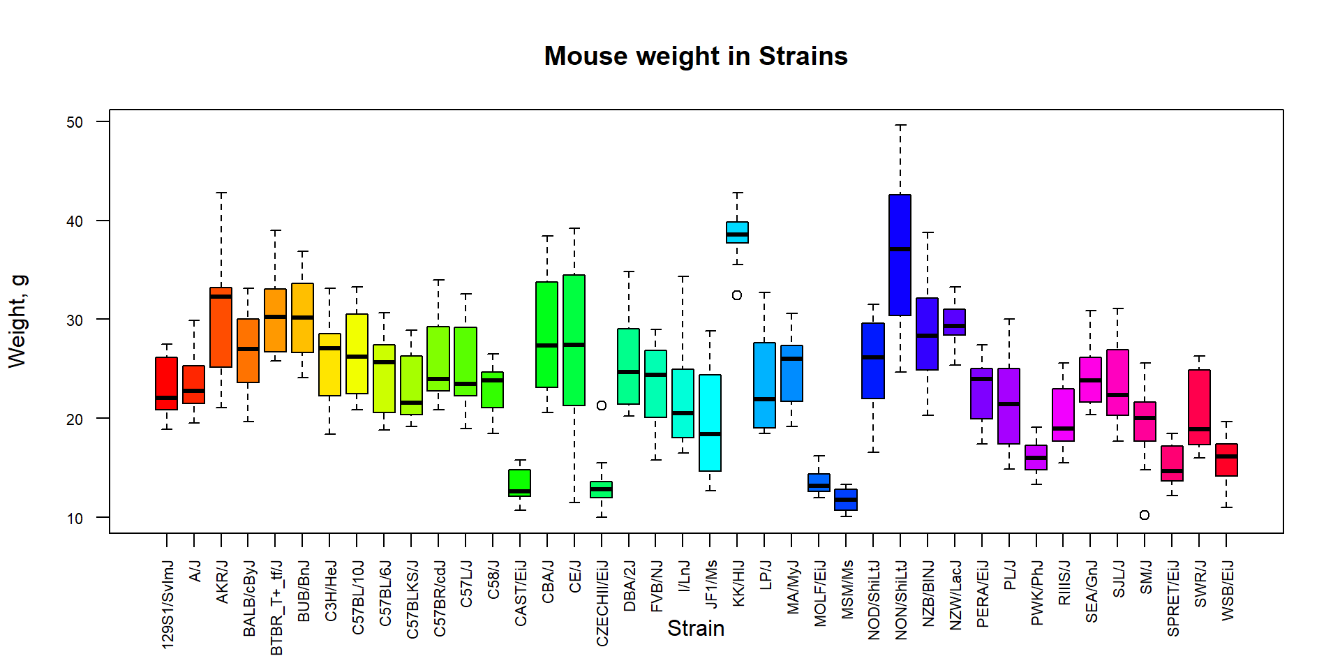
2.2. Histogram and density plots
In order to show distribution of the data you can use either histogram (precise, not beautiful) or estimation of probability density function (beautiful, approximate)
hist(miR$X,
     breaks=100,
     main="Histogram: log-intensities for miRNA",
     xlab="Values",
     col=4)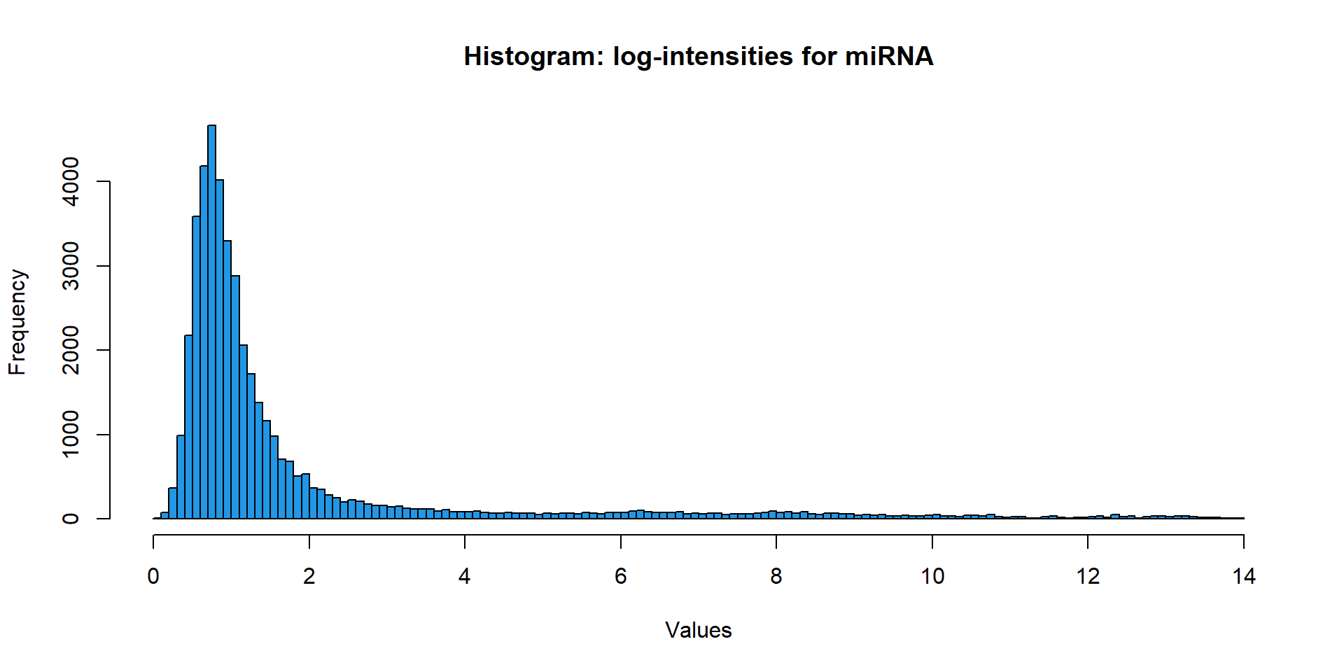
Density plots can shows a convolution of the data with smoothing Gaussian function. Parameter
plot(density(..))width- width of the smoothing function (higher - more smoothed)
Let’s compare distributions of miRNA and mRNA:
## 2 plots per window
par(mfcol=c(1,2))

## plot density of miRNA data
plot(density(miR$X),main="Log-intensities for miRNA",lwd=2,col=4)
## optional: add line with different smoothing
lines(density(miR$X,width=0.1),lwd=1,col=2) ##  try with different smoothing

## plot density of miRNA data
plot(density(mRNA$X),main="Log-intensities for mRNA",lwd=2,col=4)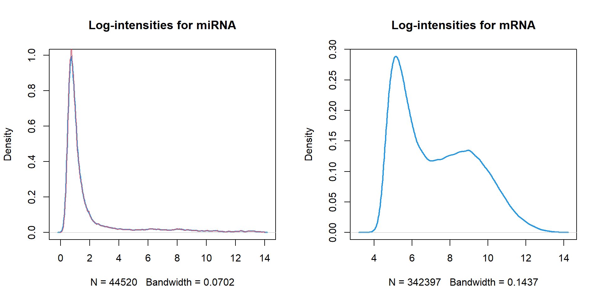
Additional functions:
lines()- adds a line to existing plotpoints()- adds point-graph to the existing plotlegend()- adds legend to the existed plotabline()- adds a line to plot (horizontal, vertical ot tilted)
I can propose you a custom function to visualize distribution in different samples. Here we will use proteomics data:
## load custom function plotDataPDF
source("http://r.modas.lu/plotDataPDF.r")

plotDataPDF(Prot$LX,ylim=c(0,0.4),lwd=2)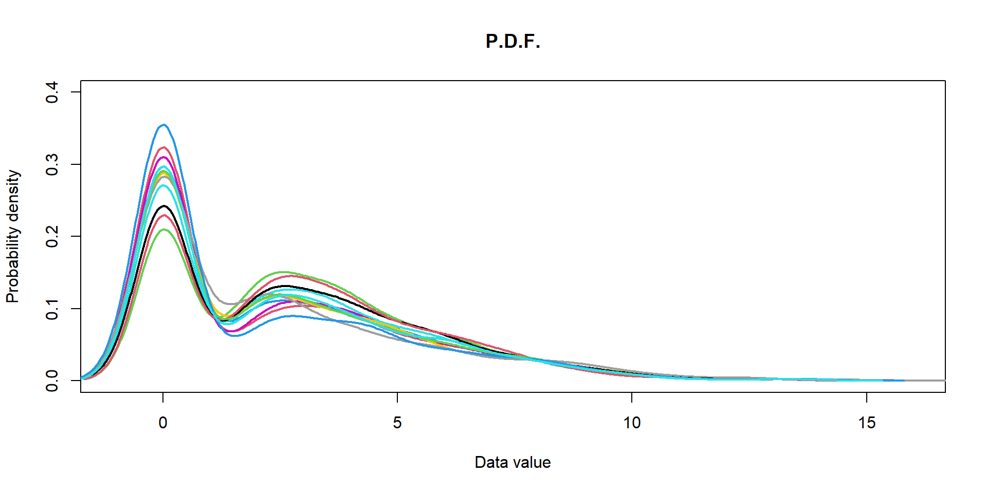
2.3 Violin plot
Violon plot combines boxplot and distribution into a single graph.
Please, first install packages vioplot and
sm
#install.packages("vioplot")
#install.packages("sm")
source("http://r.modas.lu/violinplot.r")

## create a list to visualize
L = tapply(Mice$Ending.weight, Mice$Sex, c)
str(L)
## List of 2
## $ f: num [1:396] 20.5 20.8 19.8 21 21.9 22.1 21.3 20.1 18.9 21.3 ...
## $ m: num [1:394] 24.7 27.2 23.9 26.3 26 23.3 26.5 27.4 27.5 25.8 ...
## - attr(*, "dim")= int 2
## - attr(*, "dimnames")=List of 1
## ..$ : chr [1:2] "f" "m"violinplot(L,col="skyblue",main="Weight of male and female mice") 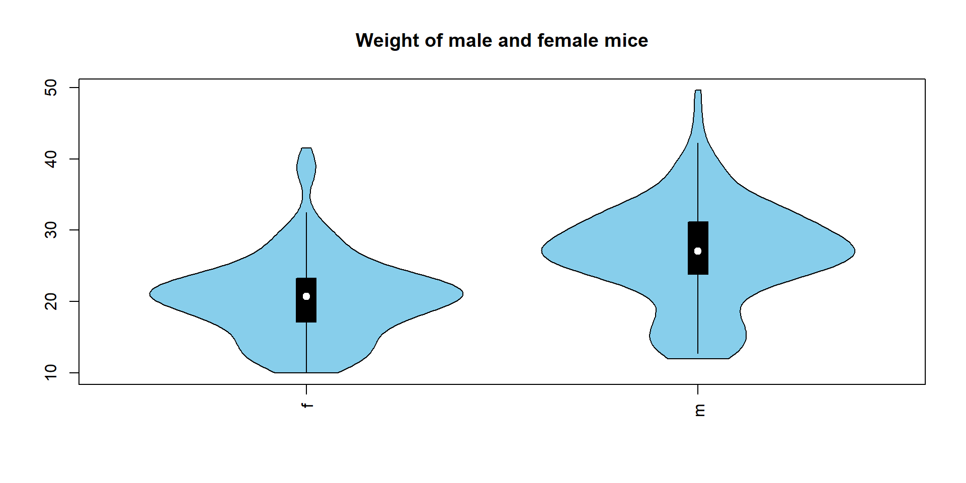
2.4. Scatter plot
A scatter plot is used to show potential dependencies between 2 variables (observations). For example, we could check how starting and ending weights of mice are connected. It can also show
plot(x = Mice$Starting.weight,
     y = Mice$Ending.weight,
     pch=19, col="#0000FF55",
     main="Scatter plot")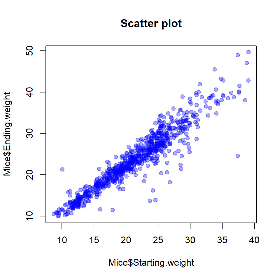
2.5. 2D distribution: smoothScatter()
Sometimes you need to show a scatter plot with many points. To keep
information about their density - use smoothScatter()
par(mfcol=c(1,2))
smoothScatter(miR$X[,1],miR$X[,2], main="Scatter-plot (replicates)")
smoothScatter(miR$X[,1],miR$X[,15], main="Scatter-plot (T72 vs T00)")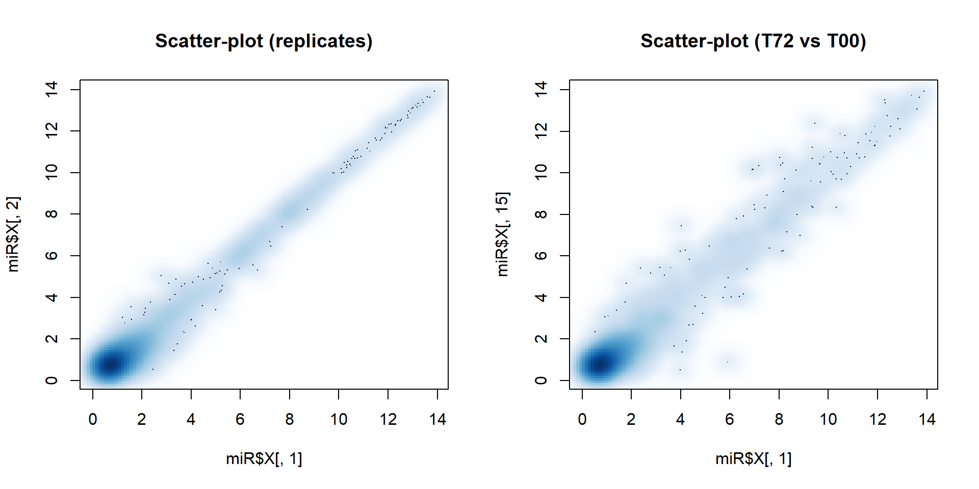
2.6. Correlation
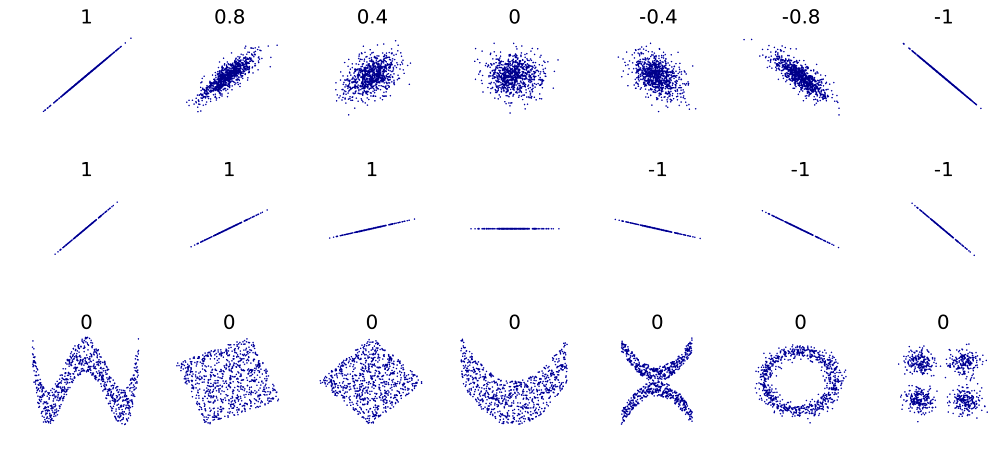
Correlation (Pearson correlation coefficient) shows the measure of the linear dependency between observations. Example:
 Square of Pearson
correlation (a.k.a. coefficient of determination, \(R^{2}\)) tells, which portion of the total
variability in variable-1 can be explained by variable-2 and vice
versa.
Square of Pearson
correlation (a.k.a. coefficient of determination, \(R^{2}\)) tells, which portion of the total
variability in variable-1 can be explained by variable-2 and vice
versa.
In R correlation between variables is calculated by function
cor(). Parameters:
use- how to deal with missing values. Use “complete.obs” or “pairwise.complete.obs” instead of “everything”.method- method used for correlation:pearson- standard parametric Pearson correlation (linear dependency),spearman- non-parametric Spearman correlation (rank correlation),kendall- Kendall rank test (ordinal associations).
Pearson correlation usually converges faster, but is sensitive to influential outliers. Spearman correlation is less powerful, but is consider each pair of points equally important. Kendall behaves like Spearman, but is very slow.
If you would like to check statistical significance of correlation,
use cor.test().
Here is the script demonstrating differences in correlation (no need to run!).
## creating (simulating) the data
x1 = 1:30 + 10*rnorm(30) # create x1 variable
x2 = 1:30 + 10*rnorm(30) # create x2 variable
x2[25] = 200 # add an outlier
y1 = x1 + 10*rnorm(length(x1))  # create correlated y1 variable
y2 = 10*rnorm(length(x2)); y2[25] = 150   # create correlated y1 variable
## fitting 2 linear models
mod1 = lm(y1~x1) # linear regression 1
mod2 = lm(y2~x2) # linear regression 2

res1p= unlist(cor.test(x1,y1,method="pearson")[c("estimate","p.value")])
res1s= unlist(cor.test(x1,y1,method="spearman")[c("estimate","p.value")])
res2p= unlist(cor.test(x2,y2,method="pearson")[c("estimate","p.value")])
res2s= unlist(cor.test(x2,y2,method="spearman")[c("estimate","p.value")])

par(mfcol=c(1,2))
plot(x1,y1,pch=19,main="`Normal` data")
abline(a=mod1$coef[1],b=mod1$coef[2],col=2)
legend("topleft",sprintf("Pearson: r=%.2f, pv=%.1e",res1p[1],res1p[2]))
legend("bottomright",sprintf("Spearman: r=%.2f, pv=%.1e",res1s[1],res1s[2]))

plot(x2,y2,pch=19,main="Data with outliers")
abline(a=mod2$coef[1],b=mod2$coef[2],col=2)
legend("topleft",sprintf("Pearson: r=%.2f, pv=%.1e",res2p[1],res2p[2]))
legend("bottomright",sprintf("Spearman: r=%.2f, pv=%.1e",res2s[1],res2s[2]))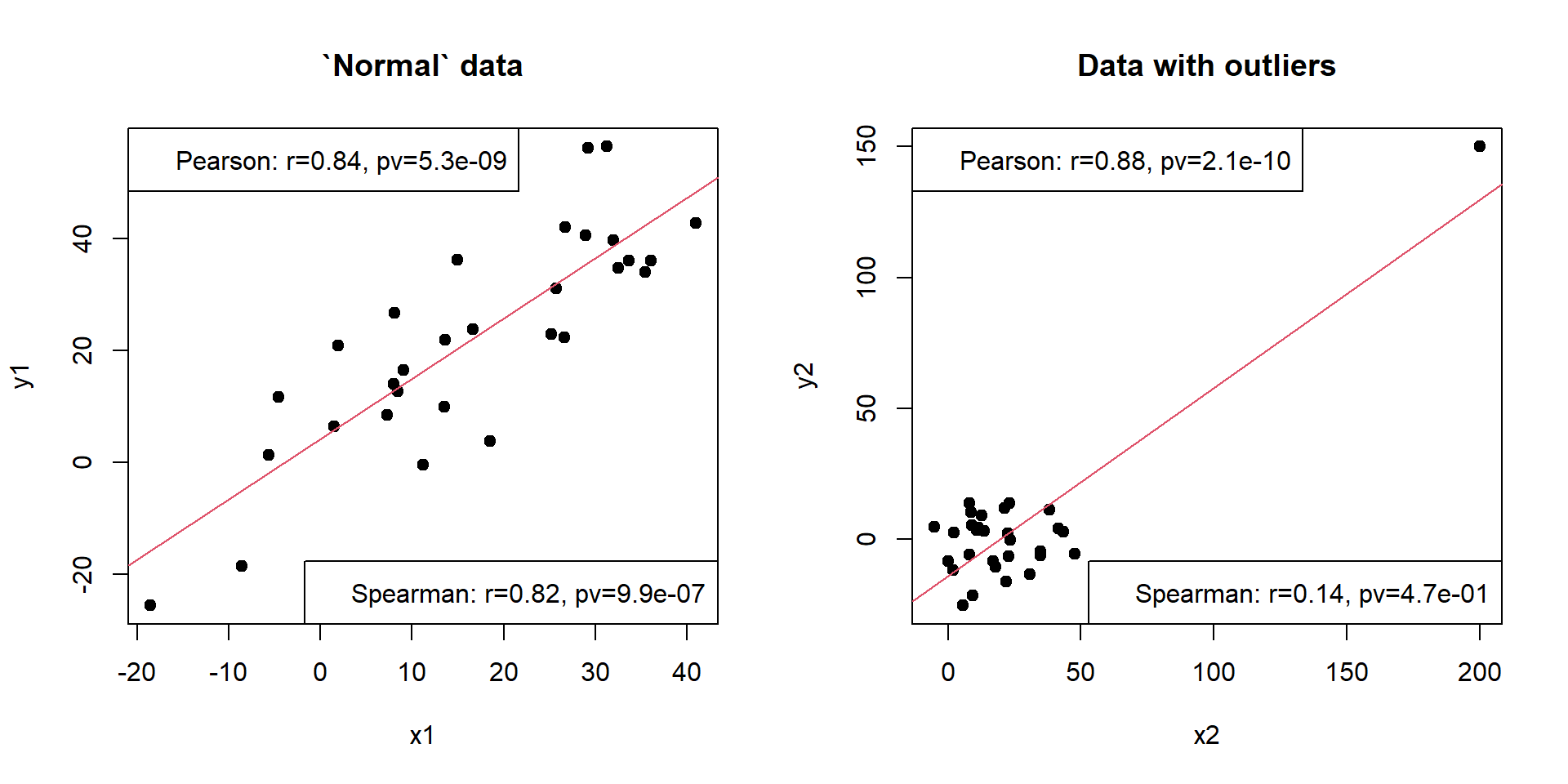
You can test significance of correlation using
cor.test(). The default null hypothesis is r=0.
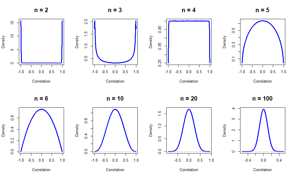
Note: Number of observations is important!
Let’s see how correlation behaves between two random vectors of different sizes.
Now let’s try to calculate and visualized correlations for all variables in the dataset.
One example is to use PerformanceAnalytics (please
install)
#install.packages("PerformanceAnalytics")

## require() is similar to library()
require(PerformanceAnalytics)

## let's look into mtcars
str(mtcars)
## 'data.frame': 32 obs. of 11 variables:
## $ mpg : num 21 21 22.8 21.4 18.7 18.1 14.3 24.4 22.8 19.2 ...
## $ cyl : num 6 6 4 6 8 6 8 4 4 6 ...
## $ disp: num 160 160 108 258 360 ...
## $ hp : num 110 110 93 110 175 105 245 62 95 123 ...
## $ drat: num 3.9 3.9 3.85 3.08 3.15 2.76 3.21 3.69 3.92 3.92 ...
## $ wt : num 2.62 2.88 2.32 3.21 3.44 ...
## $ qsec: num 16.5 17 18.6 19.4 17 ...
## $ vs : num 0 0 1 1 0 1 0 1 1 1 ...
## $ am : num 1 1 1 0 0 0 0 0 0 0 ...
## $ gear: num 4 4 4 3 3 3 3 4 4 4 ...
## $ carb: num 4 4 1 1 2 1 4 2 2 4 ...?mtcars
chart.Correlation(mtcars)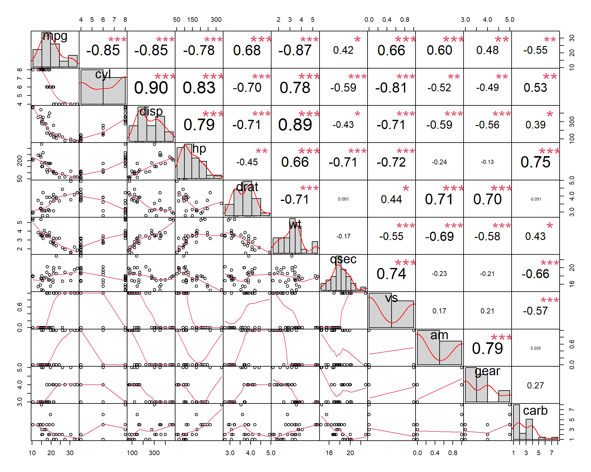
## Another example - miRNA data
chart.Correlation(miR$X)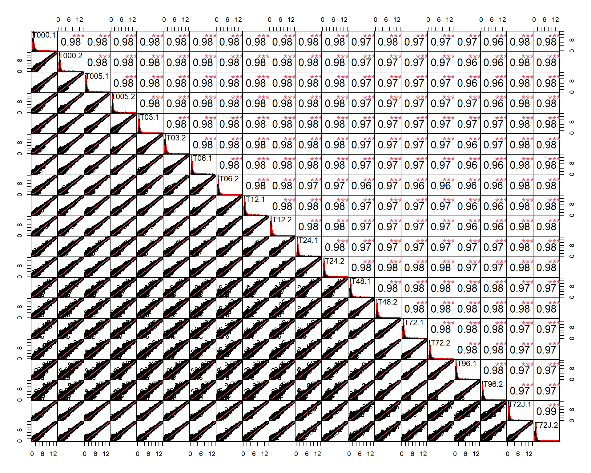
Another way to represent correlations in the dataset - via
corrplot or heatmap
Corrplot:
#install.packages("corrplot")
library(corrplot)

## calculate correlations
r = cor(mtcars)

## different visualization
par(mfrow=c(2,2))
corrplot(r, method="circle")
corrplot(r, method="pie", type="upper")
corrplot(r, method="number")
corrplot(r, method="color")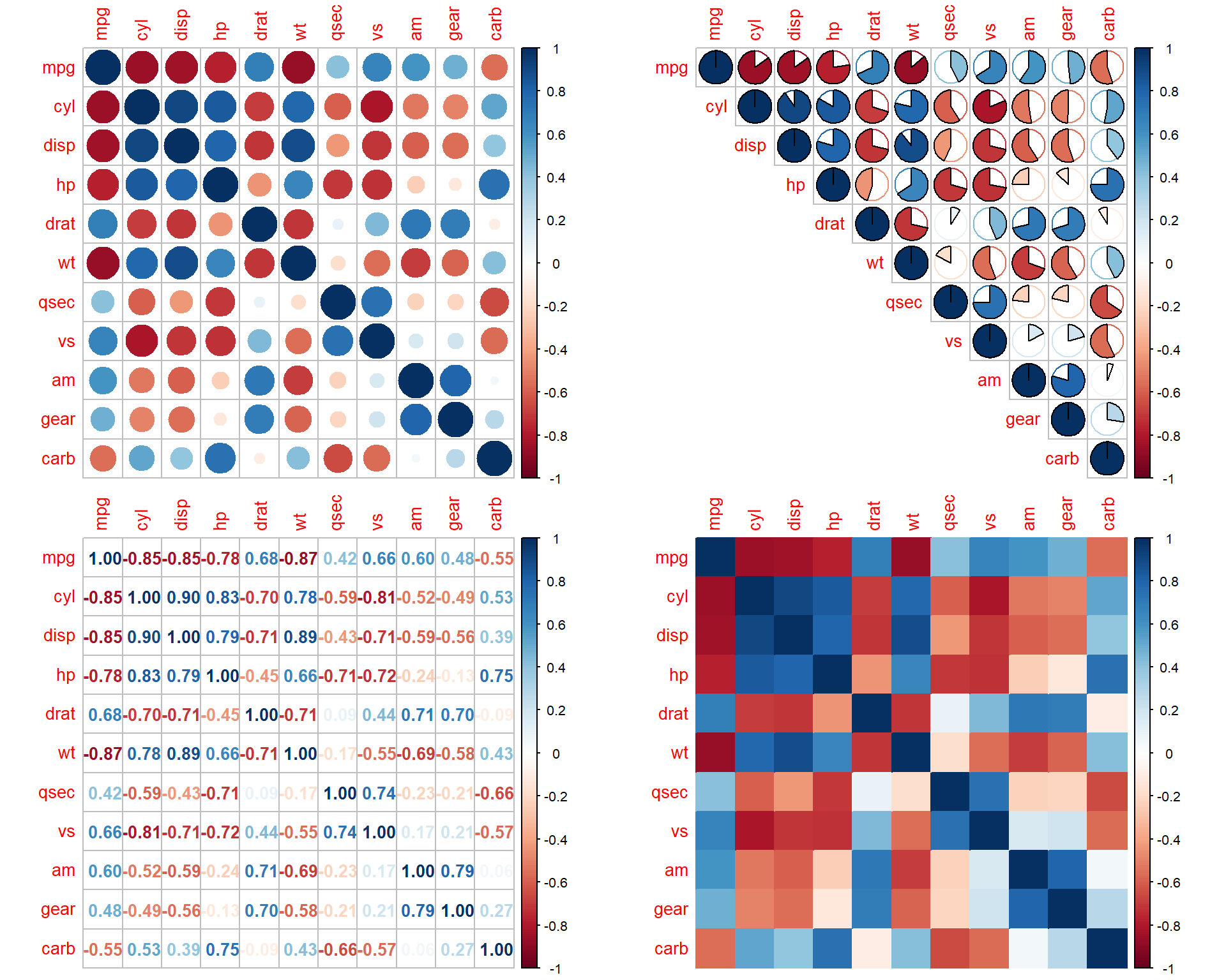
Heatmap:
library(pheatmap)

r = cor(Mice[,-c(1:3)],use = "pairwise.complete.obs")

pheatmap(r)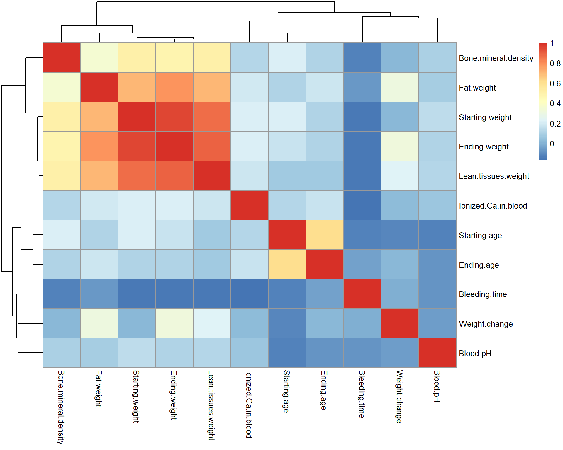
Exercises
- Build boxplot for proteomics data (data are stored in
Prot$LX).
boxplot()
- Buils a boxplot of IRF1 expression vs IFNg-treatment time (data: mRNA). You can access expression by
mRNA$X["IRF1",]and time bymRNA$meta$time.
boxplot(values ~ factor)
- Build distribution of bleeding time for Mice dataset
plot(),density(...,na.rm=TRUE)
- Analyse correlations within protein-group data. Plot and visually compare correlations in original data
Prot$X0and in log-transformed dataProt$LX
| Prev Home Next |
By Petr Nazarov
|