2. Exploratory data analysis
Petr V. Nazarov, LIH
2023-10-24
2.1. Distributions
Let’s download counts from an RNA-seq experiment. The result contains gene expression for 30 tumor-looking and 30 normal-looking samples from patients with lung squamous cell carcinoma.
url = "http://edu.modas.lu/data/rda/LUSC60.RData"
download.file(url, destfile="LUSC60.RData",mode = "wb")
Now load the dataset and investigate the structure of the object.
load("LUSC60.RData")
str(LUSC)
## List of 5
## $ nsamples : num 60
## $ nfeatures: int 20531
## $ anno :'data.frame': 20531 obs. of 2 variables:
## ..$ gene : chr [1:20531] "?|100130426" "?|100133144" "?|100134869" "?|10357" ...
## ..$ location: chr [1:20531] "chr9:79791679-79792806:+" "chr15:82647286-82708202:+;chr15:83023773-83084727:+" "chr15:82647286-82707815:+;chr15:83023773-83084340:+" "chr20:56064083-56063450:-" ...
## $ meta :'data.frame': 60 obs. of 5 variables:
## ..$ id : chr [1:60] "NT.1" "NT.2" "NT.3" "NT.4" ...
## ..$ disease : chr [1:60] "LUSC" "LUSC" "LUSC" "LUSC" ...
## ..$ sample_type: chr [1:60] "NT" "NT" "NT" "NT" ...
## ..$ platform : chr [1:60] "ILLUMINA" "ILLUMINA" "ILLUMINA" "ILLUMINA" ...
## ..$ aliquot_id : chr [1:60] "a7309f60-5fb7-4cd9-90e8-54d850b4b241" "cabf7b00-4cb0-4873-a632-a5ffc72df2c8" "ee465ac7-c842-4337-8bd4-58fb49fce9bb" "6178dbb9-01d2-4ba3-8315-f2add186879a" ...
## $ counts : num [1:20531, 1:60] 0 3 13 272 1516 ...
## ..- attr(*, "dimnames")=List of 2
## .. ..$ : chr [1:20531] "?|100130426" "?|100133144" "?|100134869" "?|10357" ...
## .. ..$ : chr [1:60] "NT.1" "NT.2" "NT.3" "NT.4" ...For fun, let’s visualize distribution of the counts and o log counts
## log transform the data and put it to X
X = log2(1+LUSC$counts)

## create window with 2 subwindows
par(mfcol=c(1,2))

## draw distribution for the counts...
## here lwd - thinkness of the line, col - color
plot(density(LUSC$counts),lwd=2,col="blue",main="Counts")

## ... and log-counts
plot(density(X),lwd=2,col="blue",main="log2(counts+1)")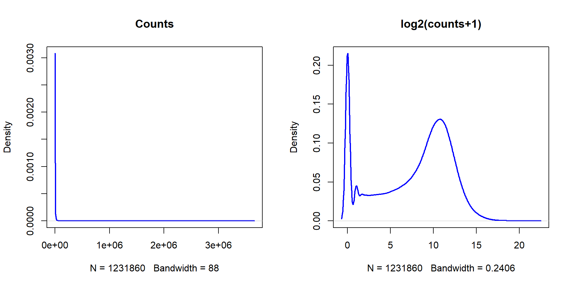
Now let’s normalize the potential bias in experimental data and build boxplots of original log2-counts (further: gene expression) and normalized gene expression.
## scale() - makes values in column such that they have mean=0, st.dev.=1 (i.e. centered and scaled)
XN = scale(X)

## boxplot of original data
boxplot(X,las=2,col="skyblue",main="Gene expression",cex.axis=0.7)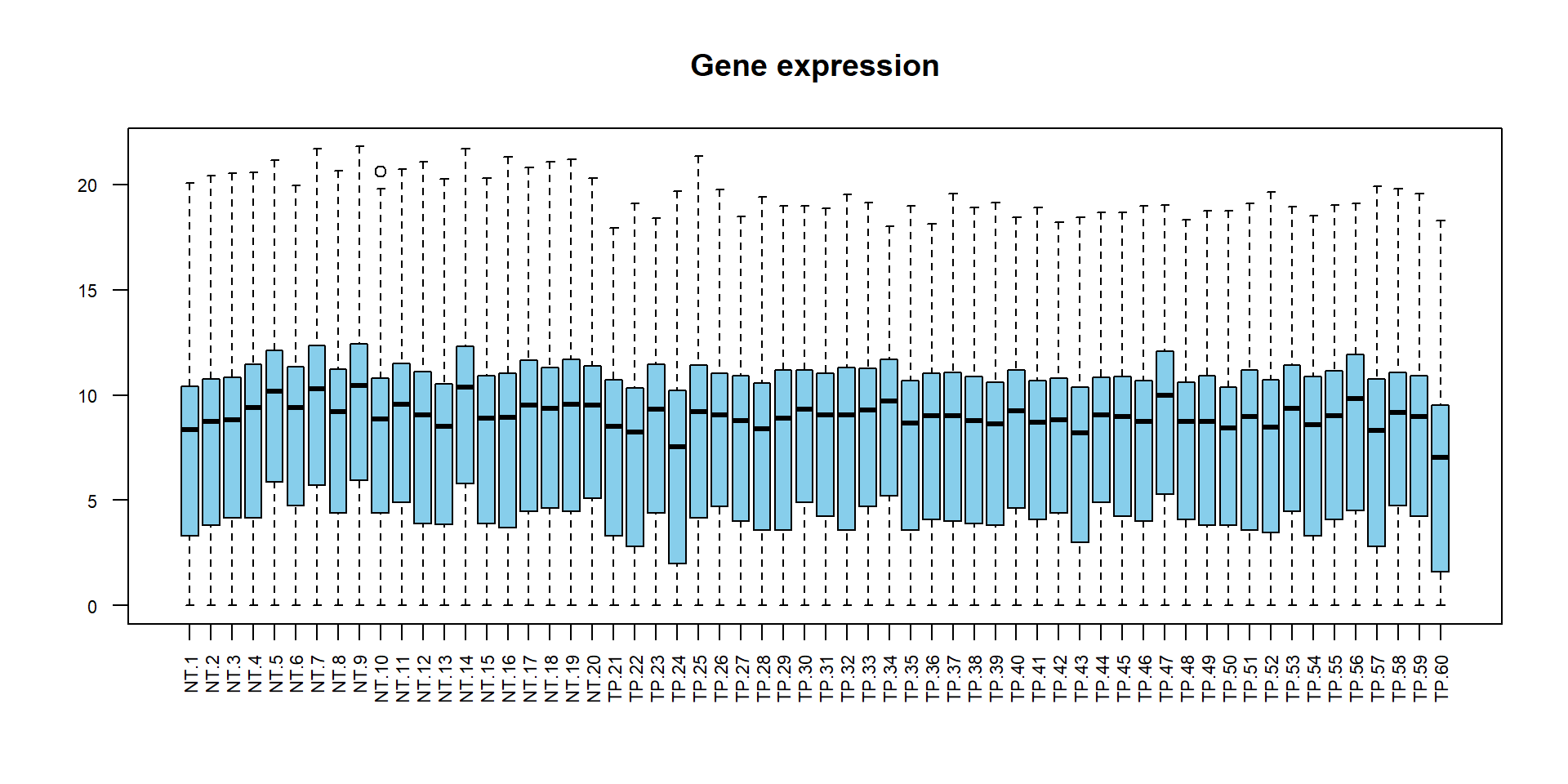
## boxplot of normalized data
boxplot(XN,las=2,col="skyblue",main="Normalized gene exoression",cex.axis=0.7)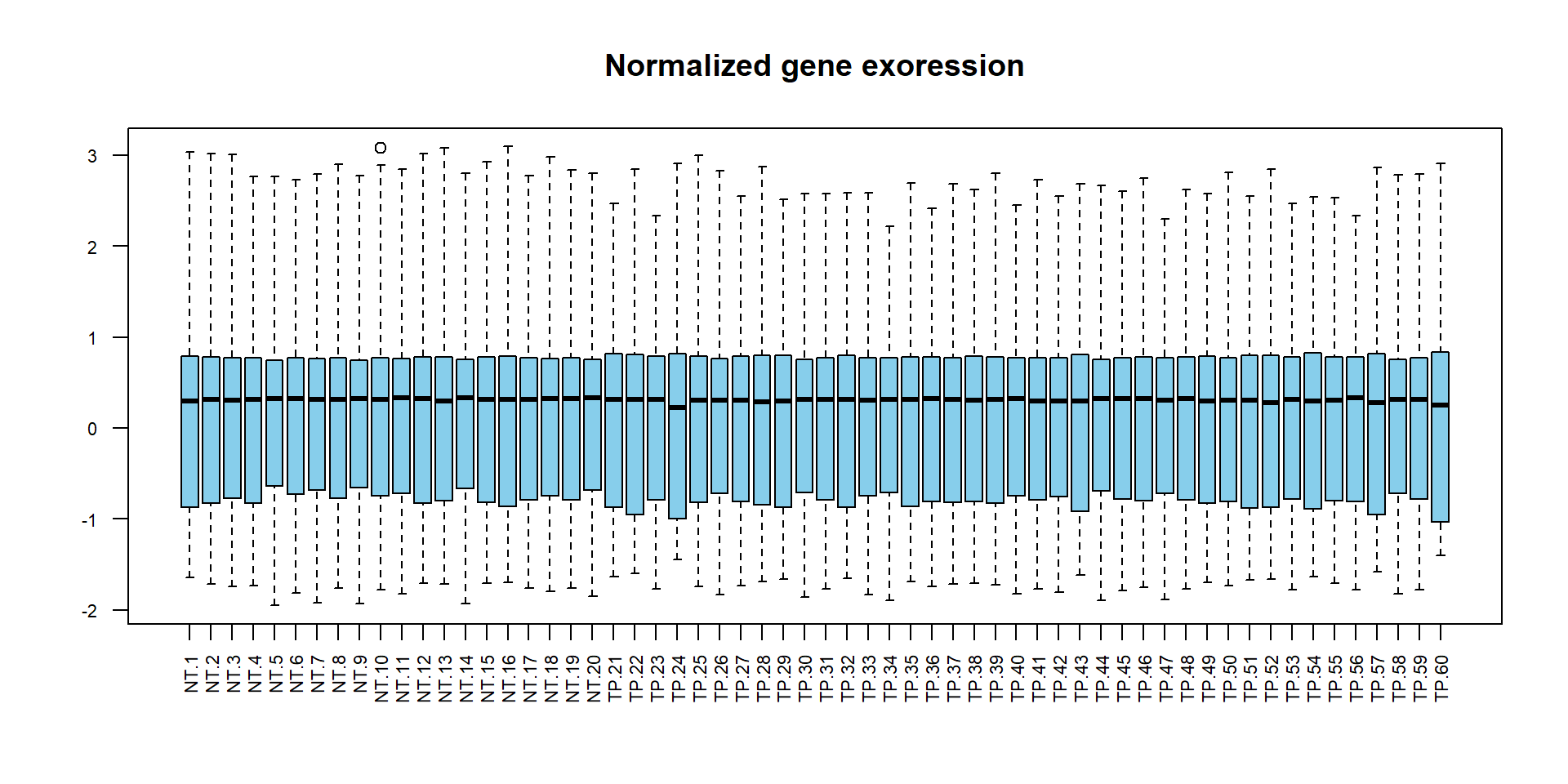
## try this:
plot(density(X), col="black", lwd=2,main="Distributions per sample")
for (i in 1:ncol(X))
    lines(density(X[,i]),col="#0000FF33")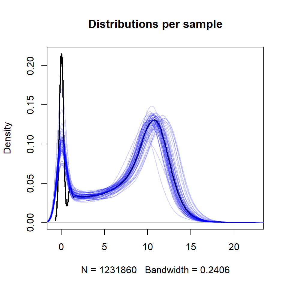
2.2. Dimensionality Reduction
2.2.1. Overview of dimensionality reduction methods
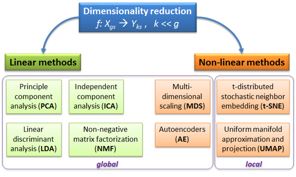
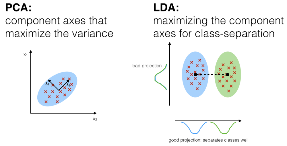
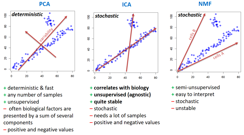
PCA - rotation of the coordinate system in multidimensional space in the way to capture main variability in the data.
ICA - matrix factorization method that identifies statistically independent signals and their weights.
NMF - matrix factorization method that presents data as a matrix product of two non-negative matrices.
LDA - identify new coordinate system, maximizing difference between objects belonging to predefined groups.
MDS - method that tries to preserve distances between objects in the low-dimension space.
AE - artificial neural network with a “bottle-neck”.
t-SNE - an iterative approach, similar to MDS, but consideting only close objects. Thus, similar objects must be close in the new (reduced) space, while distant objects are not influecing the results.
UMAP - modern method, similar to t-SNE, but more stable and with preservation of some information about distant groups (preserving topology of the data).
Please consider some nice resources online to play with and investigate:
Principal Component Analysis Explained Visually by Victor Powell
Understanding UMAP by Andy Coenen and Adam Pearce
Dimensionality Reduction for Data Visualization: PCA vs TSNE vs UMAP vs LDA by Sivakar Sivarajah
2.2.2. Principle component analysis
Let’s build PCA of these 60 lung samples.
## exclude genes with 0 variance
X = X[apply(X,1,var)>0,]

## Run PCA on the transposed X
PC = prcomp(t(X),scale=TRUE)
str(PC)
## List of 5
## $ sdev : num [1:60] 76.4 56.5 31 26.6 25 ...
## $ rotation: num [1:19939, 1:60] 0.00304 0.0051 0.00379 0.00281 0.00624 ...
## ..- attr(*, "dimnames")=List of 2
## .. ..$ : chr [1:19939] "?|100133144" "?|100134869" "?|10357" "?|10431" ...
## .. ..$ : chr [1:60] "PC1" "PC2" "PC3" "PC4" ...
## $ center : Named num [1:19939] 4.85 4.8 8.6 11.1 8.04 ...
## ..- attr(*, "names")= chr [1:19939] "?|100133144" "?|100134869" "?|10357" "?|10431" ...
## $ scale : Named num [1:19939] 1.481 1.49 0.628 0.696 1.41 ...
## ..- attr(*, "names")= chr [1:19939] "?|100133144" "?|100134869" "?|10357" "?|10431" ...
## $ x : num [1:60, 1:60] -54.28 -8.12 -6.68 66.66 155.62 ...
## ..- attr(*, "dimnames")=List of 2
## .. ..$ : chr [1:60] "NT.1" "NT.2" "NT.3" "NT.4" ...
## .. ..$ : chr [1:60] "PC1" "PC2" "PC3" "PC4" ...
## - attr(*, "class")= chr "prcomp"## Visualize
plot(PC$x[,1],PC$x[,2], pch=19,
col=c(NT="blue",TP="red")[LUSC$meta$sample_type])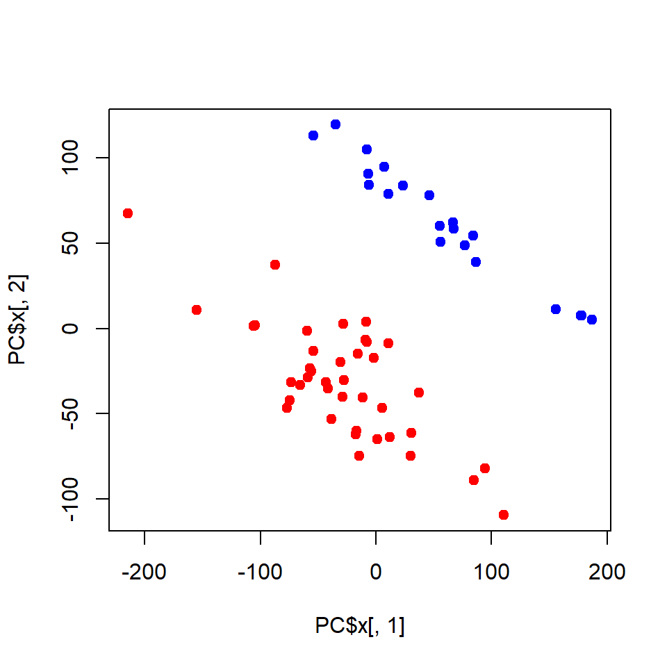
You could also use my warp-up - a bit easier to use and no need to clean and transpose
## load custom function from Internet
source("http://r.modas.lu/plotPCA.r")

## custom worp-up for PCA - see the link above to read the code
plotPCA(X, cex=1.5, col=c(NT="blue",TP="red")[LUSC$meta$sample_type])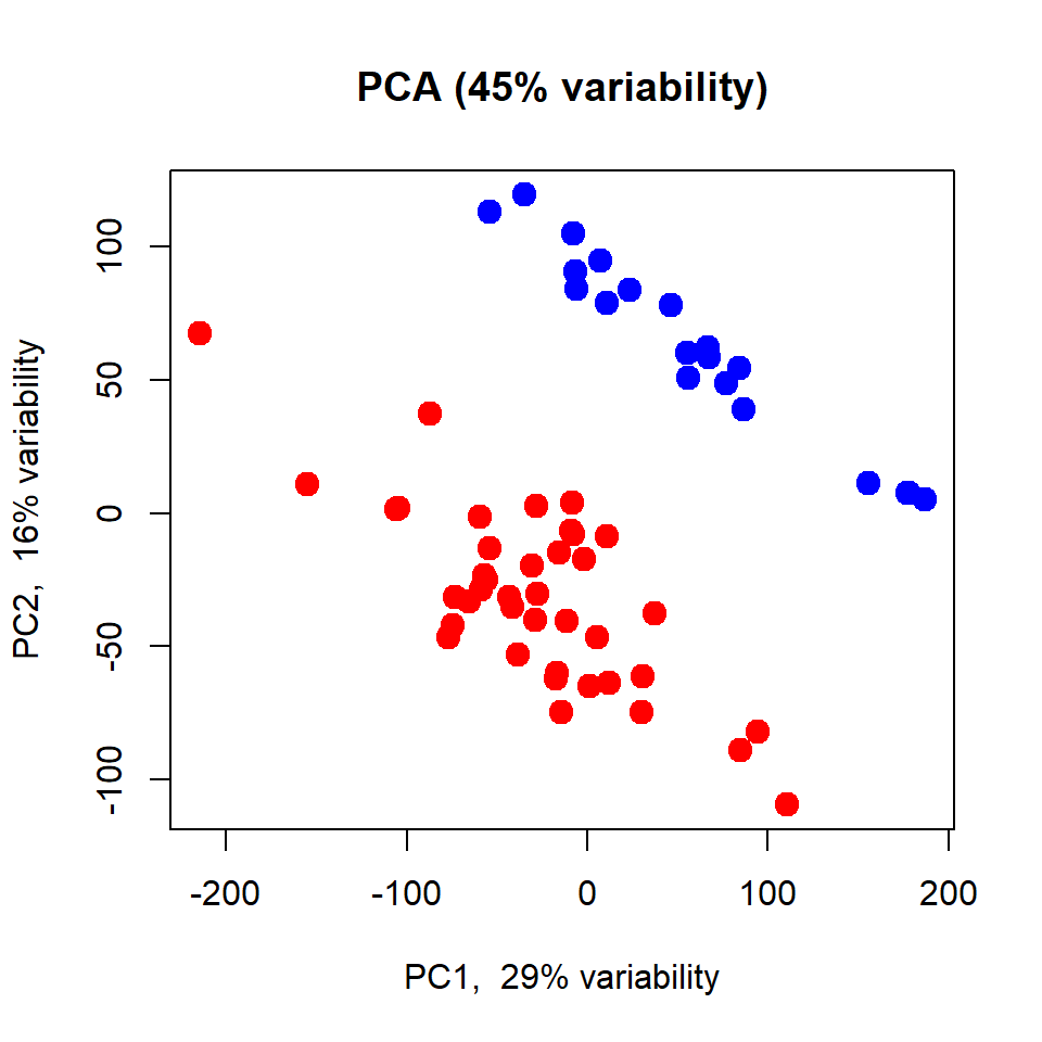
Please try to repeat the same with the complete dataset: http://edu.modas.lu/data/rda/LUSC.RData
2.3. Clustering
2.3.1. The task of clustering
2.3.2. k-Means clustering
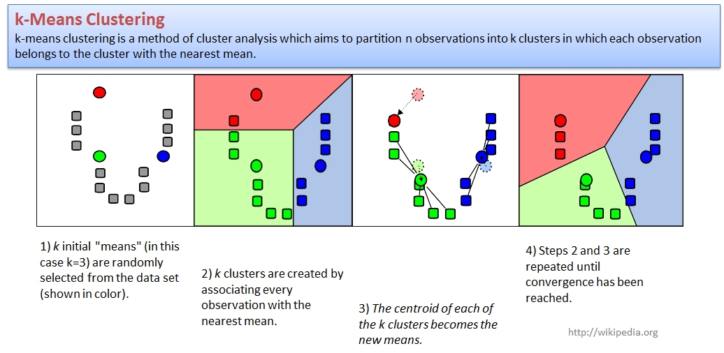
k-means clustering is a method of cluster analysis which aims to partition n observations into k clusters in which each observation belongs to the cluster with the nearest mean.
Let us try to cluster our LUSC dataset. We will use PCA to present
samples in 2D space, and next cluster with a standard
kmeans function.
centers- number of clusters (k);to make analysis more reproducible - increase
nstart
## k-means clustering
clusters = kmeans(x=t(X),centers=2,nstart=10)$cluster

## validate clusters
table(clusters,LUSC$meta$sample_type)
##
## clusters NT TP
## 1 20 0
## 2 0 40## get PCA results (use old if you have)
PC = prcomp(t(X),scale=TRUE)
## visualize as PCA, use colors to represent clusters
plot(PC$x[,1],PC$x[,2],col = clusters, pch=19, cex=2,
main="PCA, colored by k-means clusters")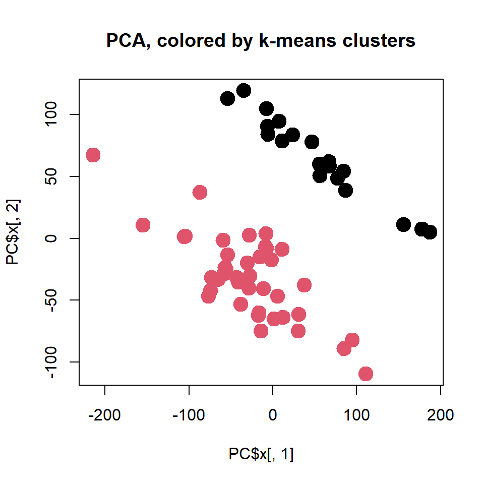
Please try different a number of clusters - k
To feel the method you could also use
irisdataset - see lecture.
2.3.3. Hierarchical clustering
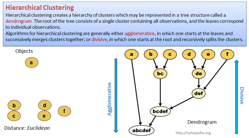
Hierarchical clustering creates a hierarchy of clusters that may be represented in a tree structure called a dendrogram. The root of the tree consists of a single cluster containing all observations, and the leaves correspond to individual observations.
Algorithms for hierarchical clustering are generally either agglomerative, in which one starts at the leaves and successively merges clusters together; or divisive, in which one starts at the root and recursively splits the clusters.
Use hclust() on distance matrix dist() to
build the hierarchical tree. We need to “cut the tree” in order to get
clusting.
par(mfcol=c(1,2))
## hierarchical clustering – generate tree and show it
hc = hclust(dist(t(X)))
plot(hc,cex=0.5)

## cut the tree to have k clusters.
clusters = cutree(hc, k=3)
table(clusters, LUSC$meta$sample_type)
##
## clusters NT TP
## 1 20 0
## 2 0 38
## 3 0 2## visualize as PCA, use colors to represent clusters
PC = prcomp(t(X),scale=TRUE)
plot(PC$x[,1],PC$x[,2],col = clusters, pch=19, cex=2,
main = "PCA, colored by hierarchical clusters")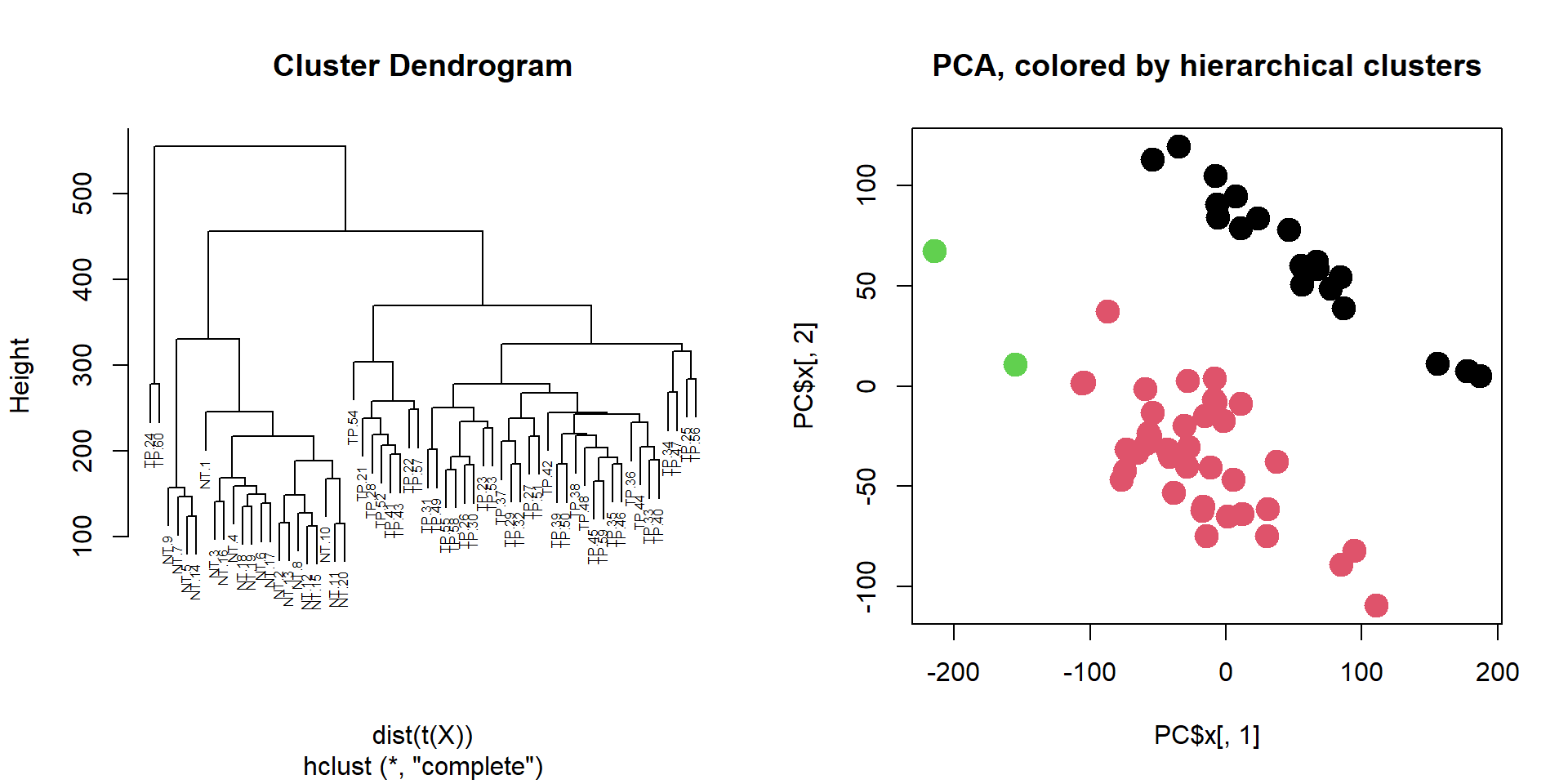
Please try a different number of clusters - k
2.4. Heatmaps
One of the most used methods for visualizing omics data is
heatmap. Here we will use heatmaps from the package
pheatmap. You should install the package before using
it.
Let’s vizualize the mos variable genes in LUSC60.
## install package (only once), remove "#"
#install.packages("pheatmap" )

## connect package
library(pheatmap)

## plot standard deviation for the genes and choose the threshold (3)
plot(density(apply(X,1,sd)))
abline(v=3,col="red")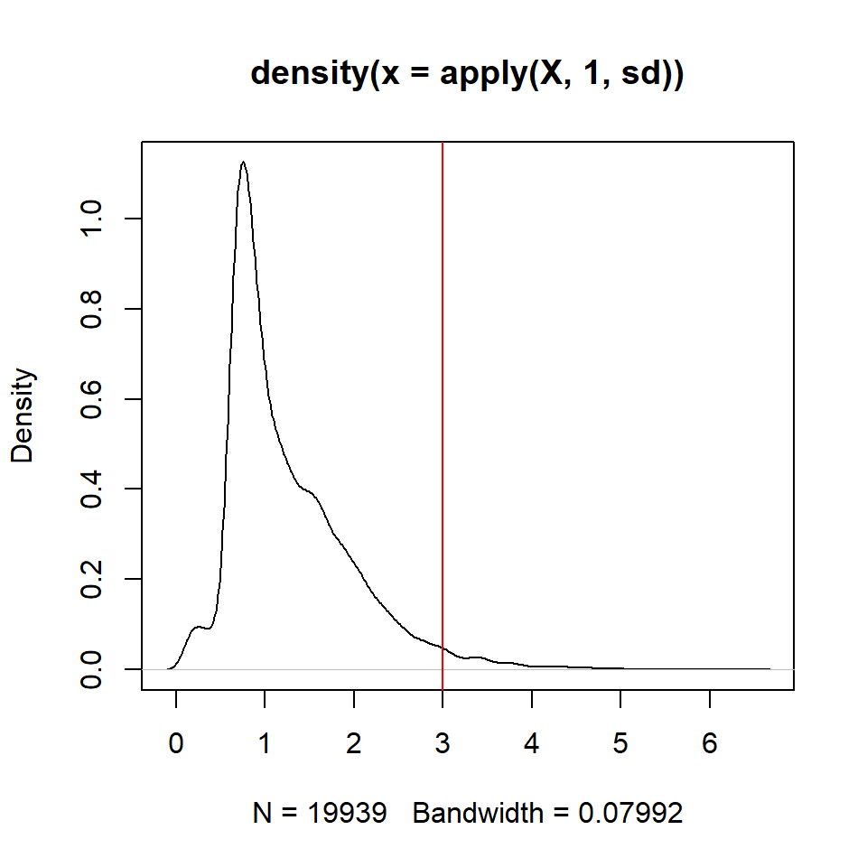
## identify the most variable genes
ikeep = apply(X,1,sd)>3
table(ikeep)
## ikeep
## FALSE TRUE
## 19421 518## draw a heatmap
pheatmap(X[ikeep,],scale="row",fontsize_row=1, fontsize_col=5,
main="Top variable genes")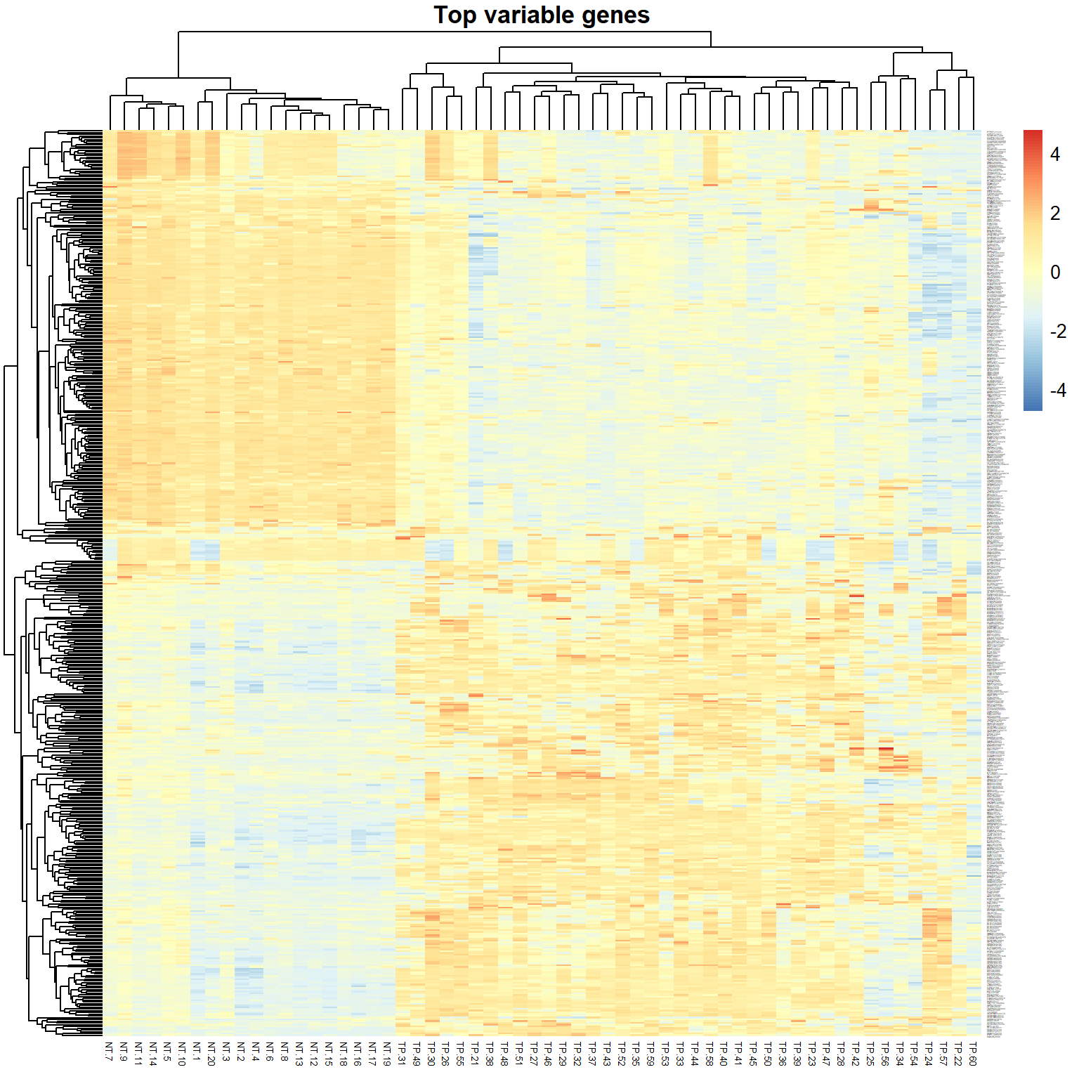 > Exercises: (1) try scale=“none”, (2) select 1000+ variable genes
(decrease threshold)
> Exercises: (1) try scale=“none”, (2) select 1000+ variable genes
(decrease threshold)
One of the standard quality control (QC) - check correlation between samples (e.g. Pearson correlation is the measure of linear similarity).
## calculate correlation between samples (columns)
R = cor(X, method="pearson")
## draw a heatmap of correlation
pheatmap(R,fontsize_row=5, fontsize_col=5,
main="Correlation between samples")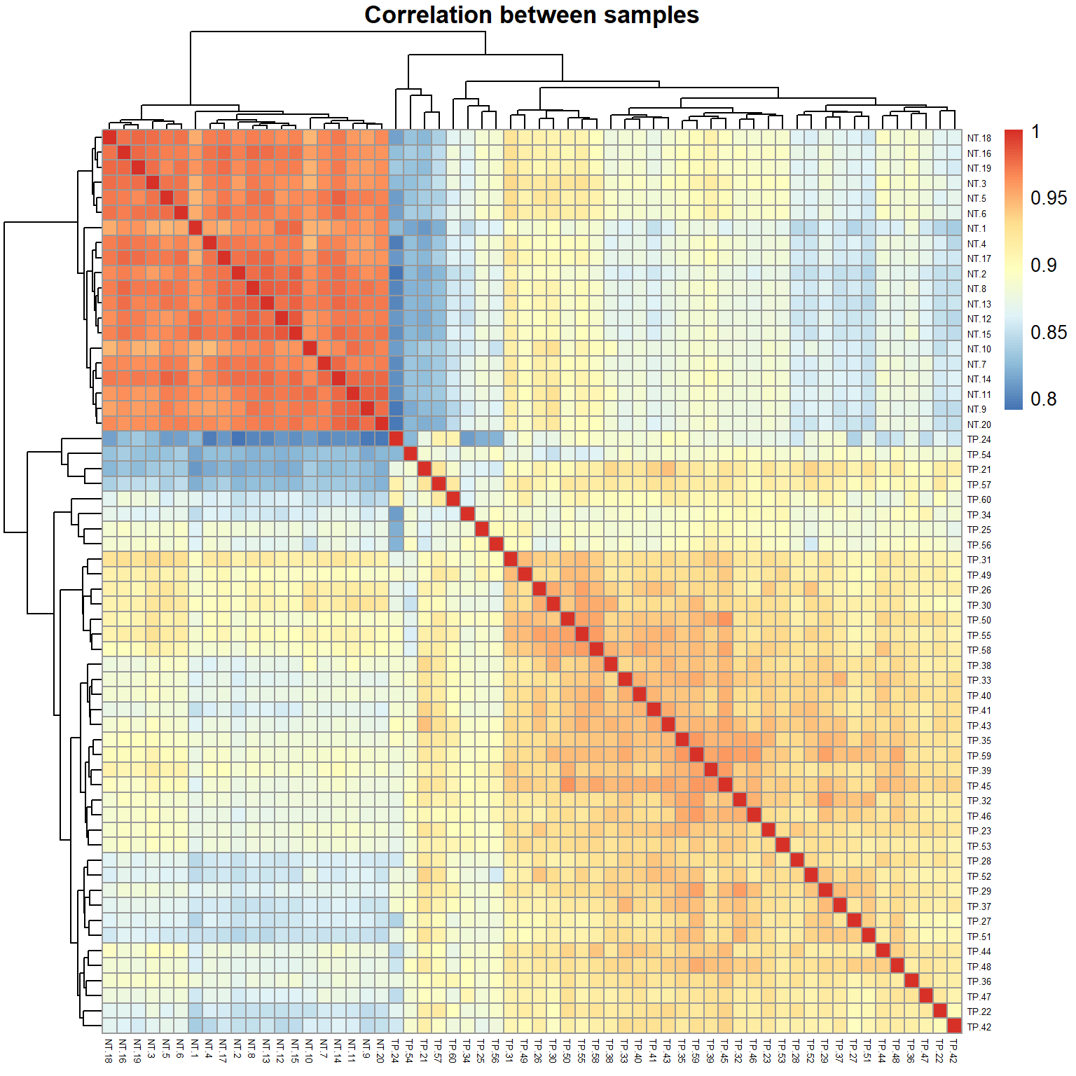 >
Can you guess, why correlation between any 2 samples is so high
(~0.9)?
>
Can you guess, why correlation between any 2 samples is so high
(~0.9)?
Take home messages
- Always check the distribution of your data! It can help you decide about pre-processing (log-transformation, normalization) and identify outliers.
- Use PCA and correlation to identify outliers or strangely behaving samples. PCA can also show you the effects of the experimental factors.
- Use clustering to group your data (unsupervised approach)
k-means method is very robust but you should know the number of clusters k
hierarchical clustering is quite flexible (k is variable) but not stable in case you exclude few samples
- Heatmap is a nice tool to visualize the expression of genes over the samples. Use heatmap of correlations to check similarity and groups in your samples.
| Prev Home Next |
By Petr Nazarov
|