5. Data Visualization
Petr V. Nazarov, LIH
2024-10-07
5.1. Plot time series
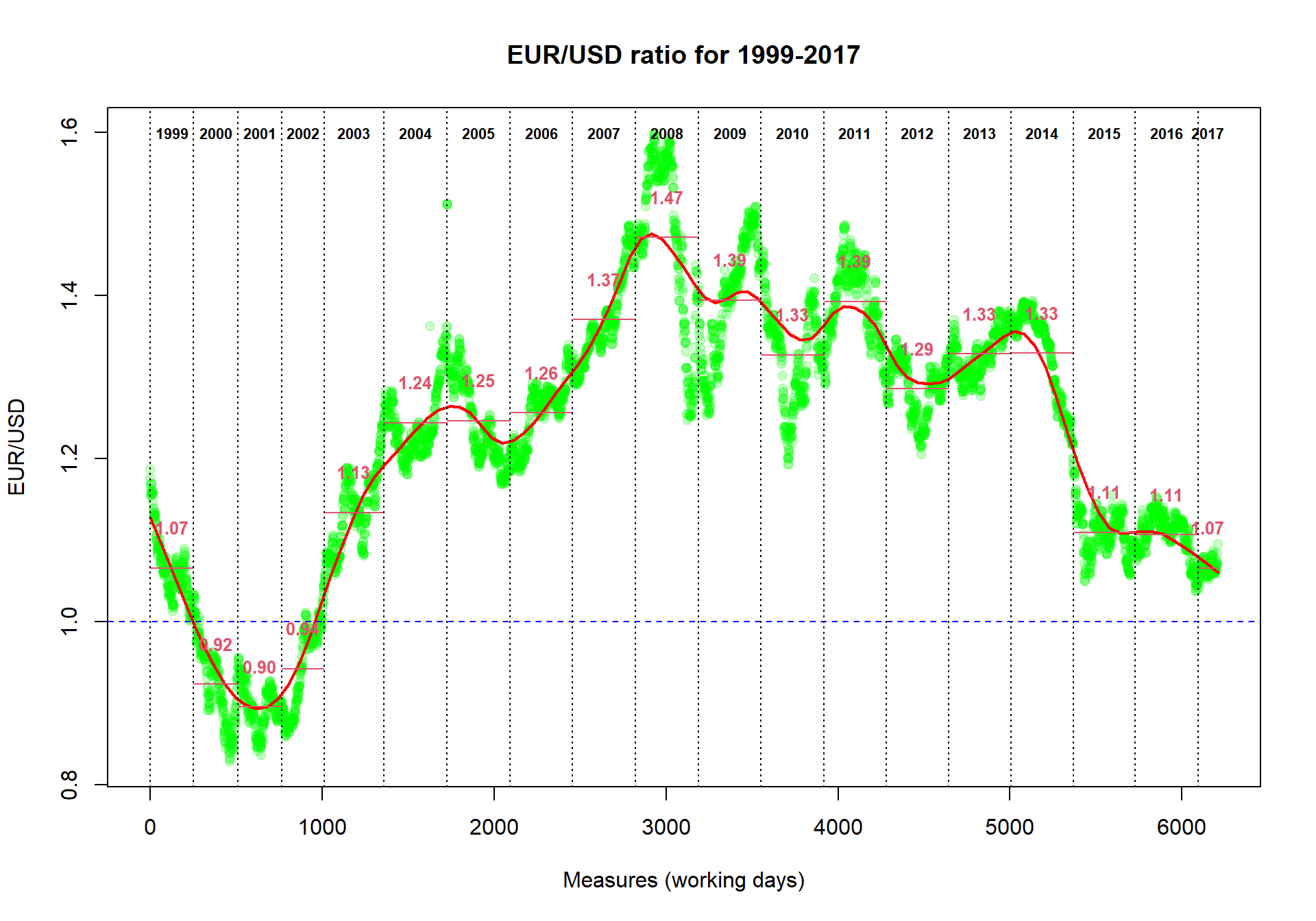
Let us come back to Currency dataset and improve the quality of its visualization.
Currency = read.table("http://edu.modas.lu/data/txt/currency.txt",header=T,as.is=T)First, we can initialize graphical window using
x11().
- You can draw your image directly to the figure file using special
devices:
pdf(),png(),tiff(),jpeg(). Always finalize drawing to file by callingdev.off()function (no parameters needed).
Please run line-by-line:
x11()  # try x11(width=8, height=5)

plot(Currency$EUR, pch=19, col = "blue", cex=2)

# pre-defined colors in R
colors()

# custom transparent color in #RRGGBB format:
plot(Currency$EUR, pch=19, col = "#00FF0033", cex=2)
There are many graphical parameters which you can tweak using
par() functions. Please, have a look by
?par
Now we will produce a more plot with smoothed interpolation and
average rate for each year. We will add lines to existing plot using
lines() and abline() functions.
text() will write some text on the plot.
pch- dot shape code. Can be set to character, like"a"cex- size of the dotsmain- titlexlab,ylab- axis nameslwd- line thicknesslty- line type (solid, dashed, etc)font- normal=1, bold=2, etc
plot(Currency$EUR,col="#00FF0033",pch=19,
     main="EUR/USD ratio for 1999-2017",
     ylab="EUR/USD",
     xlab="Measures (working days)")

## add smoothing. Try different "f"
smooth = lowess(Currency$EUR,f=0.1)
lines(smooth,col="red",lwd=2)
## add 1 level
abline(h=1,col="blue",lty=2)

## (*) add years
year=1999  # an initial year
while (year<=2017){  # loop for all the years up to now
  # take the indexes of the measures for the "year"
  idx=grep(paste("^",year,sep=""),Currency$Date)
  # calculate the average ratio for the "year"
  average=mean(Currency$EUR[idx])
  # draw the year separator
  abline(v=min(idx),col=1,lty=3)
  # draw the average ratio for the "year"
  lines(x=c(min(idx),max(idx)),y=c(average,average),col=2)
  # write the years
  text(median(idx),max(Currency$EUR),sprintf("%d",year),font=2,cex=0.7)
  # write the average ratio
  text(median(idx),average+0.05,sprintf("%.2f",average),col=2,font=2,cex=0.8)
  year=year+1;
}
5.2. Visualize categorical data
Here we will work with a dataset from Mouse Phenome project. ‘Tordoff3’ dataset was downloaded and prepared for the analysis. See the file here: http://edu.modas.lu/data/txt/mice.txt
Let’s first load the data.
Mice = read.table("http://edu.modas.lu/data/txt/mice.txt", header=T, sep="\t",as.is=FALSE)
## as.is=FALSE => we transform strings to factors
str(Mice)
## 'data.frame': 790 obs. of 14 variables:
## $ ID : int 1 2 3 368 369 370 371 372 4 5 ...
## $ Strain : Factor w/ 40 levels "129S1/SvImJ",..: 1 1 1 1 1 1 1 1 1 1 ...
## $ Sex : Factor w/ 2 levels "f","m": 1 1 1 1 1 1 1 1 1 1 ...
## $ Starting.age : int 66 66 66 72 72 72 72 72 66 66 ...
## $ Ending.age : int 116 116 108 114 115 116 119 122 109 112 ...
## $ Starting.weight : num 19.3 19.1 17.9 18.3 20.2 18.8 19.4 18.3 17.2 19.7 ...
## $ Ending.weight : num 20.5 20.8 19.8 21 21.9 22.1 21.3 20.1 18.9 21.3 ...
## $ Weight.change : num 1.06 1.09 1.11 1.15 1.08 ...
## $ Bleeding.time : int 64 78 90 65 55 NA 49 73 41 129 ...
## $ Ionized.Ca.in.blood : num 1.2 1.15 1.16 1.26 1.23 1.21 1.24 1.17 1.25 1.14 ...
## $ Blood.pH : num 7.24 7.27 7.26 7.22 7.3 7.28 7.24 7.19 7.29 7.22 ...
## $ Bone.mineral.density: num 0.0605 0.0553 0.0546 0.0599 0.0623 0.0626 0.0632 0.0592 0.0513 0.0501 ...
## $ Lean.tissues.weight : num 14.5 13.9 13.8 15.4 15.6 16.4 16.6 16 14 16.3 ...
## $ Fat.weight : num 4.4 4.4 2.9 4.2 4.3 4.3 5.4 4.1 3.2 5.2 ...If you would like to have an overview of the data, and you have a
reasonable number of columns, you can just plot() all
possible scatter plots for your data.frame
plot(Mice, pch=".", col="blue")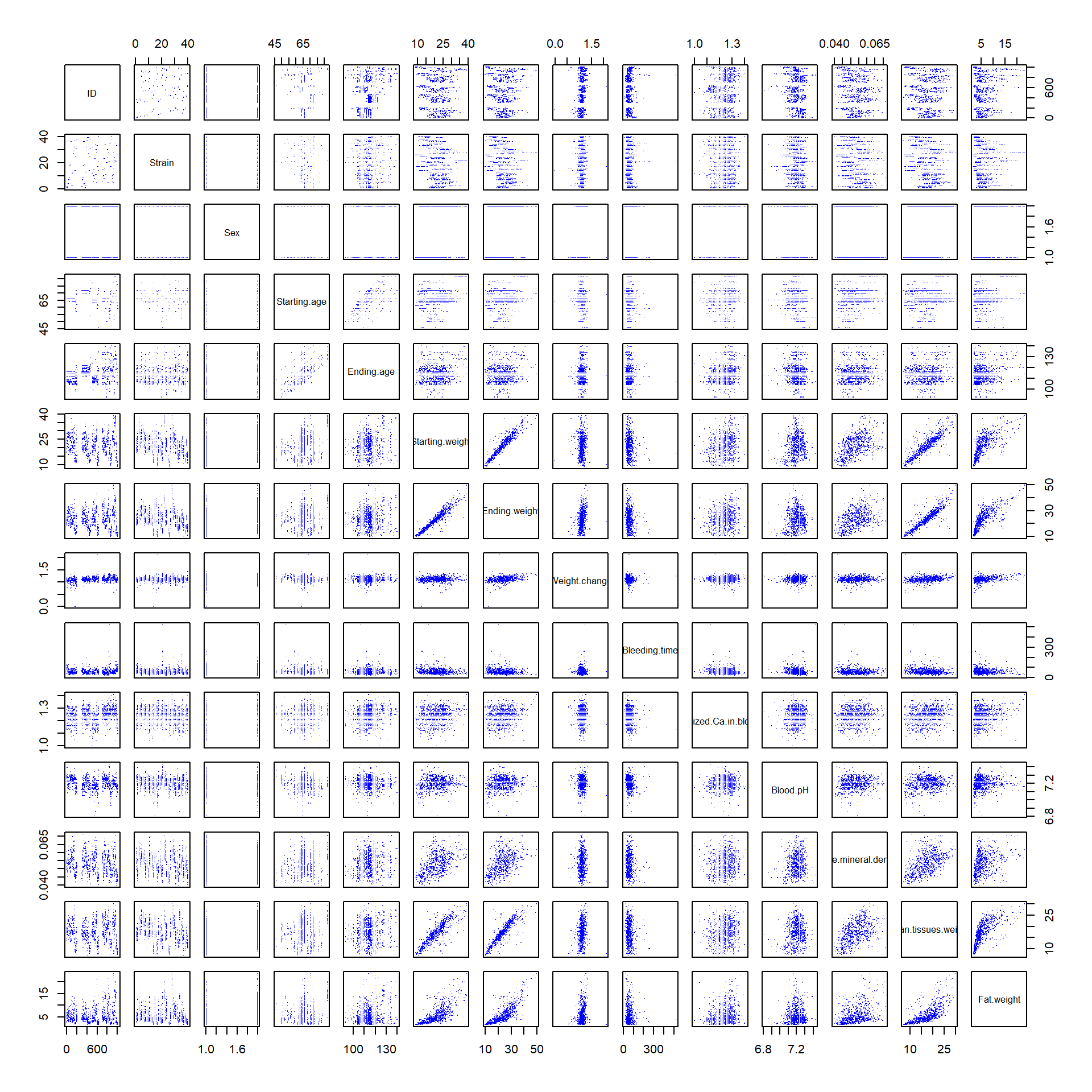
Let us plot some factorial data. For example, we can check how well was the experiment designed with respect to mouse strain.
plot(Mice$Strain)Or do it more beautifully:
las- axis text direction (2 for perpendicular)cex.names- size of the category names on the horizontal axis
plot(Mice$Strain, las=2, col=rainbow(nlevels(Mice$Strain)), cex.names =0.7)
title("Number of mice from each strain")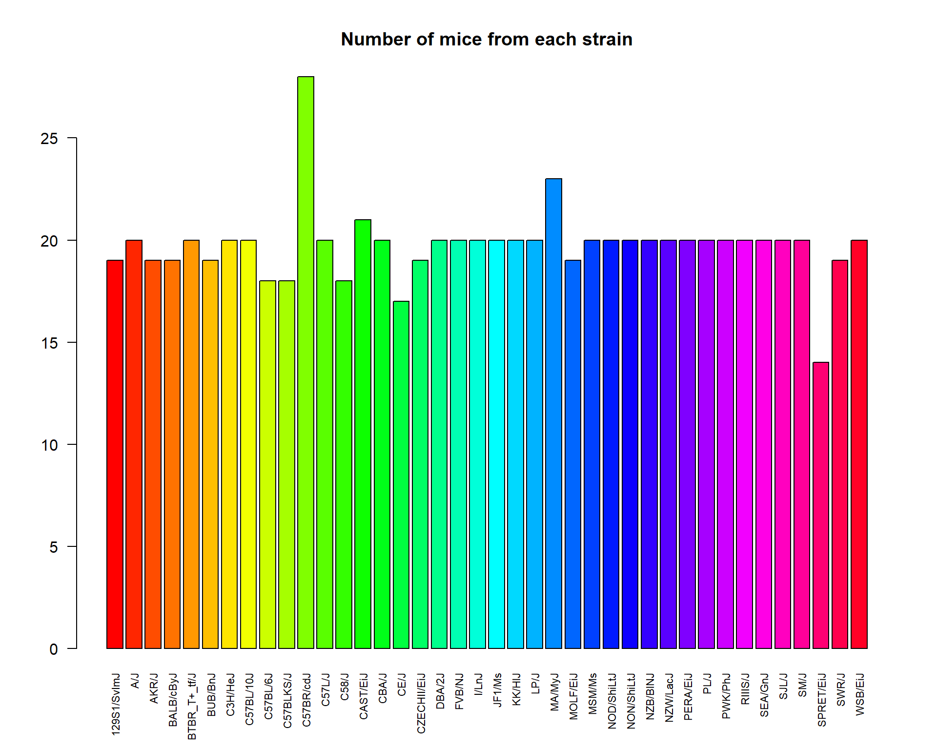
Pie-chart
pie(summary(Mice$Sex), col=c("pink","lightblue"))
title("Gender composition (f:female, m:male)")
5.3. Distributions and box-plot
Distributions can be shown using hist() or
plot(density()) functions. If you need to add line on the
existing plot, you could use lines() (or
points()) instead of plot()
hist(Mice$Starting.weight,probability = T, main="Histogram and p.d.f. approximation", xlab="weight, g")
lines(density(Mice$Starting.weight),lwd=2,col=4)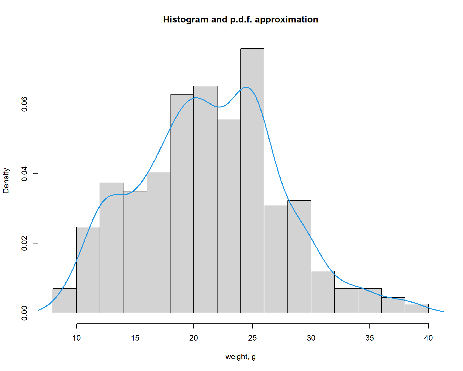
Now let us build a standard boxplot that shows starting
weight for male and female mice. We will use formula here: ‘variable’ ~
‘factor’. It is the easiest way.
boxplot(Starting.weight ~ Sex, data=Mice,
        col=c("pink","lightblue"),
        main="Weight by sex (f:female,b m:male)",
        ylab="weight, g",xlab="sex")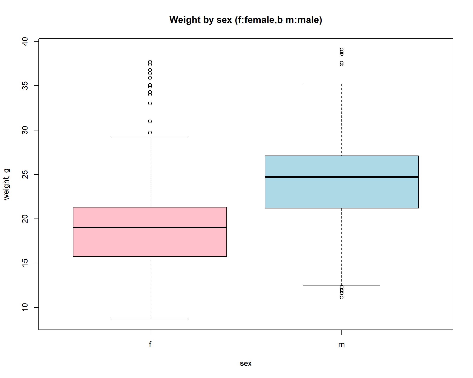
5.4. Multiple plots
You can pre-define number of plots per sheet using par()
with mfcol (by column) or mfrow (by row)
parameter. Then new new plots will be added on by one in a specific
place.
par (mfcol=c(1,2))

plot(density(Mice$Starting.weight),lwd=2,col=4,
     main="Histogram and p.d.f. approximation", xlab="weight, g")

boxplot(Starting.weight ~ Sex, data=Mice,
        col=c("pink","lightblue"),
        main="Weight by sex (f:female,b m:male)",
        ylab="weight, g",xlab="sex")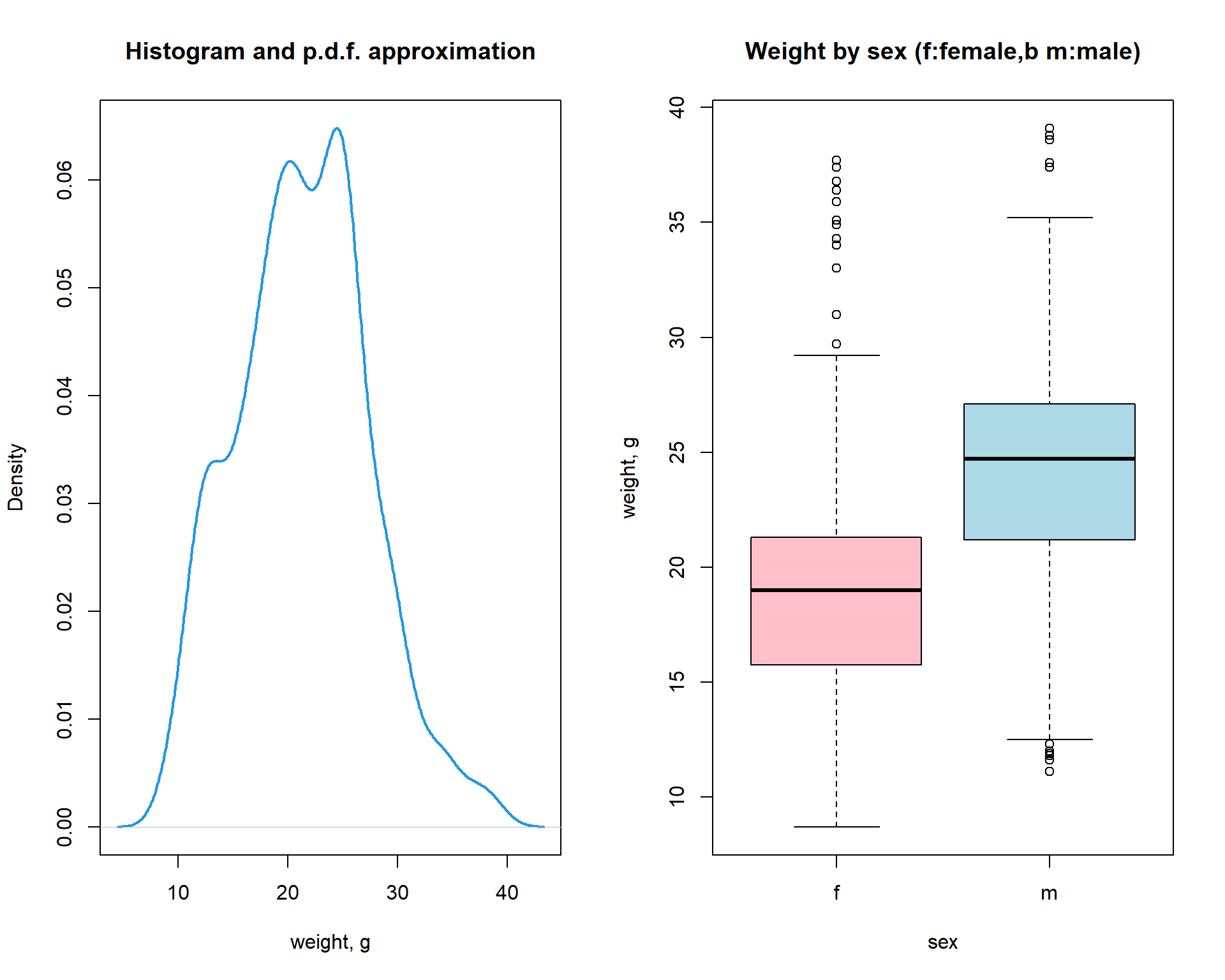
5.5. Heatmaps
Heatmaps are a useful 2D representation of the data that have 3
dimensions. Example: expression (dim 1) is measured over n genes (dim 2)
in m samples (dim 3). Heatmaps will automatically cluster the data (see
Lecture 9). Let us make a heatmap for internal Iris
dataset. We should also transform data.frame to a
matrix
# see iris dataset
str(iris)

# let us transform the data to a matrix
X = as.matrix(iris[,-5])
heatmap(t(X))
``
# add species as colors
color = as.integer(iris[,5])
str(color)
## int [1:150] 1 1 1 1 1 1 1 1 1 1 ...color = rainbow(4)[color]
str(color)## chr [1:150] "#FF0000" "#FF0000" "#FF0000" "#FF0000" "#FF0000" "#FF0000" ...heatmap(t(X),ColSideColors = color)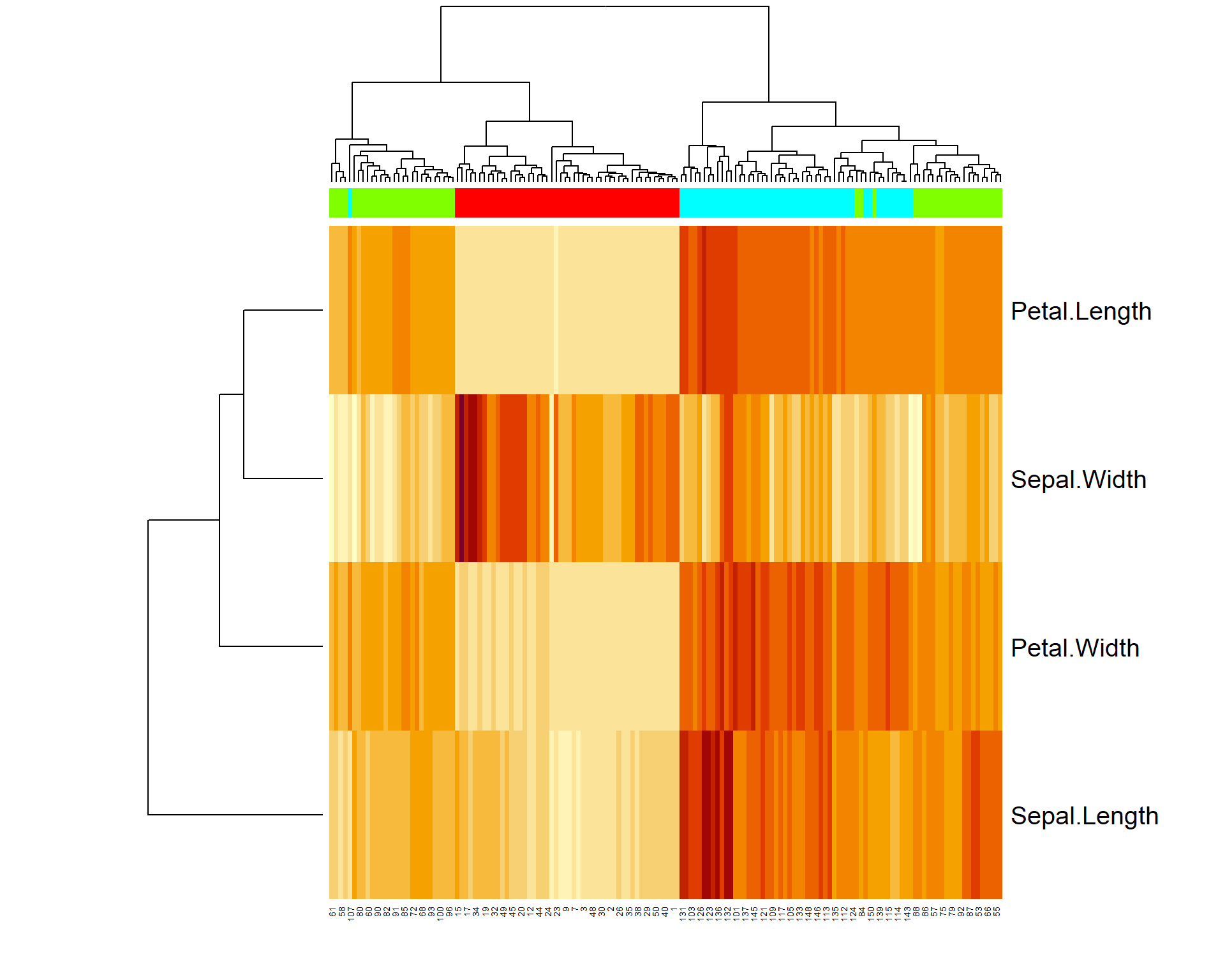
More advanced heatmaps can be built using pheatmap
package.
## uncomment to install pheatmap
#install.packages("pheatmap")
library(pheatmap)
pheatmap(t(iris[,-5]))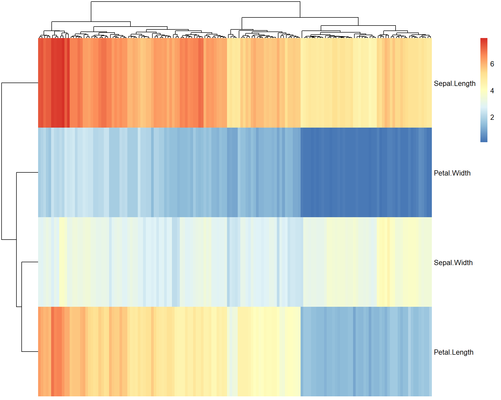
## we can control many things in pheatmap.
## let's make annotation table
rownames(iris)=paste("flower",1:nrow(iris)) ## we need to annotate flowers
ann = data.frame(species = iris[,5])        ## data.frame with 1 column
rownames(ann) = rownames(iris)              ## same annotation in ann as in data

pheatmap(t(iris[,-5]), annotation_col = ann, fontsize_col = 3, fontsize_row=15)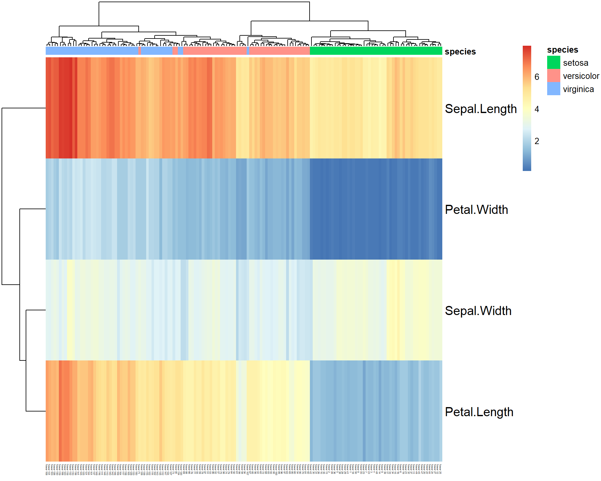
5.6. Plot into PNG and PDF
R can directly plot into PDF, PNG or other graphic files.
5.6.1 pdf()
pdf(file="test.pdf",...) opens file “test.pdf” and start
drawing to it. To stop and save the file, call
dev.off()
onefile- set toTRUEto put multiple pages into a single PDFwidth,height- width & height in inches (A4:width=8.3, height=11.7)
pdf("test.pdf",onefile=TRUE,width=8.3, height=11.7) ## open file
pheatmap(iris[,-5])
plot(iris, col=as.integer(iris[,5]))
dev.off()  ## close file
5.6.2 png()
png(file="test.png",...) opens file “test.png” and start
drawing to it. To stop and save the file, call dev.off().
Multiple PNGs can be generated if file names contains %d
substring, i.e. file="test%d.png"
width,height- width & height in pixelspointsize- scale. Default = 12. Larger the image is, lagerpointsizeshould be selected.
5.7. 3D visualization
There are options for 3D plotting in R. See static
images in demo(persp) And here is an interactive 3D plot
using rgl package:
## uncomment to install pheatmap
#install.packages("rgl")

library(rgl)

# define coordinates
x=Mice$Starting.weight
y=Mice$Ending.weight
z=Mice$Fat.weight

# plot in 3D
plot3d(x,y,z)
Exercises 1.5
- Use mice dataset. Build distributions for male and female body weights in one plot. Hint: first draw density plot for female
plot(density())and then add line for malelines(density())
plot,lines,density
- Now, add a vertical line to the plot usong function
abline(v = x). Here replacexby a value that separates male and female distributions the most, e.g. where probability density dunctions intersect.
abline
- Draw boxplot, showing variability of bleeding time for mice of different strains.
boxplotd*. Add labels to each of 2 boxplots showing the mean value of the bleeding time (for male and female)
text,mean
- Save your figure into a PDF.
- Save your figure into a publication-ready PNG. Modify parameters
pontsize,width,height
png
| Prev Home |
By Petr Nazarov
|